Tuesday, December 31, 2019

MORE MEANINGLESS YEAR-END STATISTICS

The Cleavers at the dining table, circa 1958:
More Americans now claim to converse in the living room.
Wally, is that true?
Since the end of a decade is a time people like to put out all kinds of dumb statistics, here's my contribution. I've culled these from the barrage of media kits I get every month, many of which feature homeowner surveys of various kinds—statistics on what type of appliances Americans want in their kitchens, what rooms they like to eat in, that sort of thing. They’re put out by manufacturers to sell a product, so naturally they’re biased in one direction or another.  Still, some of the results may surprise you:

Sorry, remodeling this 80s bath will have to wait—
the kitchen is even worse.
•  Contrary to the familiar stereotype of families conversing over dinner, some forty percent of Americans claim—I say claim—that they have most family conversations in the living room. Sort of puts the lie to the Cleavers, doesn’t it?  If this finding is true, it contradicts the current planning trends of either downsizing the living room or omitting it altogether. On the other hand, it may just show that forty percent of Americans are liars.  

•  Americans overwhelmingly agree that if they could afford to remodel just one room in their house, it would be the kitchen.  Fortunately, this fact dovetails nicely with the old real estate maxim that regards kitchens (along with baths) as one of the few types of remodels that return their investment when the house is sold.  

An island can work great, but only if you have tons and tons
of room to accommodate it.
Surprisingly, only 15% of Americans chose the bathroom as the first room they’d remodel.  Still, that was good enough to take second place on the wish list. 

•  Almost half of all homeowners would like an island cooktop in their kitchen.  Apparently, these are the people who’ve never worked at one before. While cooking islands may look great in TV kitchens, they’re patently impractical for real-life cooking.  For one thing, they require both cooking utensils and sloppy ingredients to be needlessly carried across an aisle.  Worse, they’re also tremendous space hogs, gobbling up dozens of precious square feet in useless aisle area.  My advice?  Unless you’ve got both money and space to burn, skip the island kitchen.  

Simply press the button, and twenty pounds of trash
will be turned into twenty pounds of trash.
•  Ostensibly, one in seven Americans pine for a trash compactor--an appliance that essentially turns twenty pounds of trash into twenty pounds of trash.  Actually, with all the recycling going on nowadays, most households should have very little garbage left over to compact. Ah well—chalk one up for the marketing industry.

•  Two out of three Americans want a garbage disposer. No big surprise there. Curiously, though, people in the eastern half of the nation demand batch-feed  models—those in which the stopper has to be installed to turn the machine on—
Grrrrrrrrrrrrrrrrrrr!
while out west where I am, people overwhelmingly prefer continuous-feed models.  Apparently, we westerners still like to live dangerously.  Interesting, no? 

Oh, never mind. Happy 2020.


Monday, December 23, 2019

TOUCHING ARCHITECTURE: Don't Leave Out The Tactile Dimension

Berlin'e Brandenburg Gate: Go ahead and touch it.
(Architects: Langhans and Schadow, completed 1791)
“Please don’t touch!”  

You won’t see that admonition in great buildings too often, as you usually do in museums and galleries. If architecture really is an art—”frozen music”, as Friedrich von Schelling put it in 1809—then it’s the most engaging and people-friendly art there is.  

The famous knife0edge corner of
I. M. Pei's National Gallery in
Washington D.C:: It's been touched
by a million sticky-fingered kids.
Whereas great works of painting and sculpture are almost invariably off limits, even the greatest works of architecture seldom carry such restrictions. The Brandenburg Gate doesn’t have a sign saying, “Please don’t touch the columns.”  The famously alluring knife-edged corner of I. M. Pei’s addition to the National Gallery in Washington D.C. carries the smudges from a million sticky-fingered kids, yet no one grumbles about it, except maybe the janitors. For the most part, the world’s greatest works of architecture are eminently available for tactile inspection. This is living art in the best sense.

Well, so what?

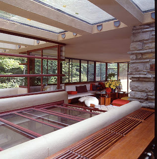
A whole plethora of textures awaits
visitors to Frank Lloyd Wright's
Fallingwater in Bear Run, Pennsylvania
Touch—the opportunity for tactile exploration of form and texture—is one of the most important yet neglected aspects of architecture. Though you may not be aware of it, when you enter a building for the first time, you don’t just look at it—you feel it. Consciously or not, you judge whether it’s flimsy or substantial, elegant or seedy, real or fake, all by touch. Do the railings wobble and the floors bounce underfoot? Or do things really feel like they’re here to stay?

Touch also provides much of the pleasure and variety in architecture. Among the most brilliant aspects of Frank Lloyd Wright’s work was his studied use of contrast in material textures. For example, his 1936 masterpiece, Fallingwater, is a virtual symphony of stone and stucco, steel and glass. As you move through it—or through any other fine work of architecture—such combinations work subliminal magic on your psyche. You come away tingling without quite knowing why.  

Today's interiors use acres of drywall,
and they feel cheap because they
ARE cheap.
Alas, today it’s the vanilla twins of stucco and drywall, along with the incomparable elegance of vinyl windows, plastic moldings, and pressboard doors, that provide the dominant textures in our homes. Our houses aren’t just built cheap—they feel cheap, too. Even though today’s pumped-up extravaganzas are routinely tarted up with crown moldings and glitzy hardware, these items usually flunk the touch test.  More often than not, they feel cheap, hollow, and flimsy.   

By contrast, textures abound in Carr Jones's
Hermans Residence, Oakland, California, 1928
(Lovely photo by my co-author Doug Keister)
Is there an alternative?  Consider the work of an architect such as Carr Jones, who built lovely, personal homes of brick, clay tile, and wrought iron. Though these are among the most ancient and humble building materials, they impart both rich textures and an incomparable sense of solidity. Thanks to them, every surface in Jones’s houses delights not only the eye, but the hand as well. 

Maybe in today’s wired, net-surfing culture, in which so many of us—including me—sit around diddling plastic keys all day, our appreciation for the genuine and permanent textures of life has slipped a little.

If so, I’m sure we’ll come around again.  I just get that feeling.

Wednesday, December 18, 2019

THE GRAMMAR OF ARCHITECTURE: Cut The Bull

Calvin Coolidge:
"You Lose."
Unlike the present occupant of the White House, the thirtieth president of the United States, Calvin Coolidge, was a man of few words. His terse responses to the press have become legendary.  It’s said that a reporter once breathlessly approached him, saying:  “Mr. President, I bet my friend here I could get you to say three words.”  
Coolidge’s reply:  “You lose.”

Can you guess what Frank Lloyd Wright's central theme
was for the Robie House? (Oak Park, Illinois: 1909)
Silent Cal’s presidential record may have been less than stellar, but his aversion to bombast remains a lesson to us all, particularly in light of today's events.  And while politicians might be the first to learn from Coolidge’s reticence, designers could take a few hints too.  
That’s because architecture is a visual language, and just like a spoken one, it can get cluttered by a lot of extraneous blather. It’s no accident that grammatical terms such as idiom, context and articulation also appear in the language of architecture. Moreover, many of the bromides of good communication—be clear, be concise, make your point and get out—apply to design as well.  

Utter incoherence: Designs like this demonstrate
why simplicity is a virtue.
As a great believer in both simple writing and simple design, I humbly offer a few guidelines to help slash architectural bombast:  

•  Use a strong central theme rather than a number of weak ones.  Just as the title of an essay informs all of the statements to follow, an architectural composition should have a single dominant idea that suffuses the whole.  The theme might lie in the way rooms are organized—in a courtyard, perhaps, or in a cluster—or it might have to do with using a favorite combination of materials, or even a certain style of roof.  Other elements can support or echo the central theme, but they shouldn’t compete with it, since this only dilutes your overall statement.

Mies van der Rohe's Barcelona Pavilion of 1928.
Now this was a guy who knew when to shut up.
•  Remember that, more often than not, simplicity is a virtue.  The mind tires when it’s forced to wade through a lot of excess information, whether it’s verbal or visual.  A clear, concise, immediately comprehensible design is far better than a conglomeration of elements drawn from hither and yon.  Leave out anything that doesn’t relate to the “argument”.  If you’re feeling tempted to include, say, a whole plethora of moldings in your design, first ask yourself whether they’ll strengthen your statement, or just obfuscate it.

Don't forget that not all architecture is serious:
Spadena House, Beverly Hills, California,
Designer: Harry Oliver, 1921.
•  Know when to shut up.  In 1863, a then-famous orator named Edward Everett gave a florid two-hour dedication speech at a Pennsylvania cemetery.  At the same event, the nation’s president spoke for just a few minutes.  Which speech do we remember? Right—the one we call the Gettysburg Address. And just as a speech loses effectiveness if it goes on and on, a strong design motif can become cloying if it’s endlessly repeated.  If you love round-arched windows, for example, you might use them in one prominent focal area and, if it’s appropriate, repeat them in a few other subsidiary locations--but don’t go wild and make every window in the house round-topped.

•  Finally, don’t forget to include a bit of humor.  There’s enough bad news in the world as it is, so both language and architecture can benefit from the occasional spark of wit.  Recall that even the most pious of architectural monuments, the Gothic cathedrals, were rampant with highly personalized carvings of gargoyles that no doubt gave their creators a few good laughs, and still do the same for us all these centuries later.  

Tuesday, November 5, 2019

SOME GRAVE OBSERVATIONS

Mausoleum of Big four railroad magnate
Charles Crocker, Mountain View
Cemetery, Oakland, California (c 1888)
Suppose I told you about a marvelous outdoor museum of architecture with full-scale examples of every major building style of the past hundred years? And suppose I told you it’s in a beautiful park-like setting that’s great for picnicking, and that there’s no admission fee, and that thousands of people can be found there every day of the year?

Would it matter to you if just about all of those people were dead? If so, proceed to the Wall Street Journal. Otherwise, read on.

Cemeteries contain some of the most splendid—and overlooked—collections of architecture to be found anywhere. And heaven knows, there are plenty of them around. Every metropolitan area has some venerable and important cemeteries nearby. Near my own home outside San Francisco, for example, is Oakland’s Mountain View Cemetery, laid out—as it were—by the famed landscape architect Frederick Law Olmsted of Central Park fame. Here, a series of hillside mausoleums known as Millionaire’s Row boast the last architectural efforts made on behalf of Charles Crocker of transcontinental railroad fame, F. M. “Borax” Smith, chocolatier Domingo Ghirardelli, and numerous other 19th-century high rollers.  Just down the street is a 1926-vintage columbarium designed by architect Julia Morgan, of Hearst Castle fame.  
Ionic columns grace the miniature Greek temple mausoleum
of the Corby family, Pine Grove Cemetery, Manchester, N.H.
(Image: nutfieldgeneology.com)

The caliber of  structures in this relatively obscure cemetery should give you some inkling of the architectural jewels you’re likely to come across in your own town.  The crypts, monuments, mausoleums, and other structures found in large cemeteries nationwide represent a microcosm of American architectural fashions, including not only the expected Gothic Revival, but also Egyptian and Greek Revival, Romanesque (Richardsonian and otherwise), Victorian, Craftsman, Art Nouveau, Art Deco, and Modern. Here, cheek by jowl, you’ll find pyramids, obelisks, temples, domes, and cathedrals, as well as a more than a few architectural creations that defy description.  Since the main purpose of all these designs is simply to look impressive, they’re about as close to pure architecture as anything you’re likely to encounter.  
Egyptian Revival—an especially popular style for funerary
architecture—taken to the limit at the West Point Cemetery
mausoleum of civil engineer Egbert Viele, West Point, N.Y.
(c. 1902) (Image: Wikipedia Commons)

Should you decide to take a Sunday drive to your local cemetery/architecture museum, here’s some basic terminology: 

A crypt is a chamber for storing bodies, while a mausoleum is a large tomb containing crypts and entered through a doorway. A vault is an underground tomb, or a tomb tunneled into the side of a hill, though it can also refer to a mausoleum whose decoration is limited to the facade only.  A columbarium is a building containing niches for the display of cremated remains. The last is a fairly recent development in funerary architecture, since the practice of cremation did not gain acceptance in America until the late 19th century.     
Even renowned modernist architect Louis Sullivan
is represented in funerary architecture—here by the
Wainwright tomb in St. Lous's Bellefontaine Cemetery.
(c. 1892)

One highly unusual thing about cemetery structures is that, since their occupants aren’t too concerned about planning for the future, they’re practically never remodeled or modernized. Standing row upon row, sheathed in slabs of marble and granite, they stand essentially as they did on the day they were built.  

And despite the thousands of people who occupy these miniature cities of stone, crowds are not a problem. If you love old buildings but can’t stand the hustle and bustle of the usual tourist traps, this is the place for you. Temporarily, I mean.
  

Tuesday, October 29, 2019

PG&E PUNISHES CUSTOMERS FOR THE FAILURES OF ITS 19TH-CENTURY GRID

The Camp fire, Paradise, California, November 2018.
A PG&E equipment failure was likely the ignition source.
(Image: Josh Edelson, Getty Images)
Suppose the electronic device you’re reading this on developed a problem that made it burst into flames when the temperature rose above 80. Now further suppose that rather than correcting the problem with the device, the manufacturer proposed the following remedy:

“We know that our device may start a fire if the weather gets too hot. So from now on, whenever the temperature in your area goes above 80 degrees, we’re going to remotely disable your device until the temperature drops. This is for your safety.”

How long would you be using this company’s device? For that matter, how long would you patronize any business that addressed problems by shunting them onto the customer? Well, if that business were a utility monopoly like California’s Pacific Gas and Electric, you wouldn’t have any choice in the matter.

The technology of California's
electrical grid (and for that matter
the whole nation's) has hardly changed
in the past 120 years. See bottom image.
Many Californians have found this out the hard way during the last few weeks, because shunting the problem onto the customer is exactly how PG&E is dealing with the shortcomings in its aging and poorly maintained grid. Over the past few years, failures in PG&E equipment has been responsible for a number of devastating California wildfires, including the catastrophic Camp fire that wiped out the entire town of Paradise, among others. The utility is currently in bankruptcy due to the blizzard of lawsuits arising from this fire and others.

There’s no doubt that California’s wildfire problem has been exacerbated by the tinder-dry state of much of the state’s wildland—a clear effect of climate change. Yet the fundamental issue is not one of warming climate, but rather in equipment failure due to PG&Es generations-long lack of investment.

Downtown Stockholm, Sweden: Unlike
the United States, the Swedes began
relocating much of their electrical
grid underground during the 1940s
and 1950s.
Nevertheless, PG&E has unilaterally decided that, in order to mitigate future fires, it will simply turn off the electricity to literally hundreds of thousands of Californians for days at a time—never mind that these shutdowns impose incalculably vast losses to California residents and businesses alike.

Most galling of all: when asked how long this so-called policy might continue, the utility has stated that it would take at least ten years for it to “harden” its grid infrastructure.

The fact is that PG&E and its precursors have already had better than a century to modernize California’s power grid, yet it remains an essentially nineteenth-century construct. Despite serving a region hosting the most advanced computing technology in the world, much of the company’s electric grid remains solidly planted in the Victorian era. This lack of investment is the inevitable result of entrusting a public utility to a private monopoly, albeit one ostensibly “regulated” via a cozy relationship with its purported overseer, the California Public Utilities Commission.

The 24th Infantry mustering for the Spanish-American
war; the place is Salt Lake City, Utah; the date
is April 24, 1898. Does anything look familiar?
There’s been no such stinginess on PG&E’s part viz-a-viz its shareholders, however, and that is the basic problem. A utility serving millions should not be a private, for-profit business. It probably shouldn’t be a business at all. The same can be said for countless other utilities across the nation who continue to use nineteenth century infrastructure to supply twenty-first century needs.


Tuesday, October 22, 2019

WHY ROOFS LEAK

Wright's roofs: "They don't call it Fallingwater for nothing."
(Bear Run, Pennsylvania,  completed 1939)
The root purpose of every dwelling—one that dates back millennia—is to provide shelter from the elements. Hence, an architect’s most fundamental charge is to design a weathertight building. Unhappily, it doesn’t always work out that way. One of the most common complaints I hear is, “Why can’t architects design homes that don’t leak?”  

The embarrassing fact is that leaky roofs are endemic to architecture, whether modern or traditional, and the caliber of the architect makes little difference. The occupants of Frank Lloyd Wright’s most celebrated houses have been obliged to drag out buckets, bowls, and soup cans in many a rainstorm. Or as a colleague of mine once put it:  “They don’t call it ‘Fallingwater’ for nothing”.    

For their part, architects are notoriously adept at brushing off the leak problem. Wright once received a call from an irate client who complained that the roof was leaking all over her dinner guest.

The architect Le Corbusier bears much of the responsibility
for stoking the flat roof craze of the Modernist era.
(Villa Savoye, Poissy, France,  completed 1933)
“Tell him to move his chair,” he responded.  To the complaint of another waterlogged client, he calmly declared:  “If it didn’t leak, it wouldn’t be a roof.”

At least Wright fessed up to these shortcomings, however nonchalantly;  the same can’t be said for the famed International Style architect Le Corbusier.  Early in his career, he designed a building with a conventional pitched roof. At the first snowfall, it leaked like a sieve—due, it seems, to his own inexperience.  In a classic piece of Modernist logic, however, Corbu concluded that the whole concept of pitched roofs must be flawed, and thereafter espoused flat roofs instead.

Ah, poor posterity!

If you're looking for countless leaks, this is the roof for you.
Otherwise, heed the famous acronym KISS: Keep It Simple, Stupid
Given that architects have such a hard time designing watertight roofs, what chance does a lay person have? You’d be surprised.  Here are a few simple, common-sense suggestions that can help minimize the likelihood of leaks:

•  Keep the roof design as simple as possible. Leaks seldom occur out in the middle of a roof’s flat surfaces—or “field”, in roofing parlance. Rather, they tend to develop in the many nooks and crannies formed where roof planes intersect, or where roofs abut walls. Hence, the simpler the design, the fewer the intersections, and the less the likelihood of leaks. Be especially wary of those craggy alpine roofscape favored by current architectural fashion. All those cute little peaks and dormers can become a major leakage headache a few years down the road. 

Frank Lloyd Wright: "If it didn't leak,
it wouldn't be a roof."
•  Minimize “penetrations”. In roofspeak, this term refers to pipes, vents, chimneys, skylights, and any other openings that interrupt the roof’s membrane. Like intersections, they’re far more likely to develop leaks than the field of the roof.  Minimize the number of vents and flues penetrating the roof surface, and use a few large skylights rather than a lot of little ones. And don’t locate skylights in roof valleys, where it’s difficult to seal or “flash” them properly.   

•  Avoid built-up (“flat”) roofs whenever possible. Granted, built-up roofs are cheap, easy to construct, and great for covering oddly-shaped floor plans. However, without conscientious maintenance—which they seldom get—built-up roofs simply won’t stay watertight.  A half-century of painful experience has borne this fact out, suggesting that our pitch-roof loving forebears were probably right after all. 

Sorry, Le Corbusier.

Monday, October 14, 2019

ONE REASON ARCHITECTS BLOW THE BUDGET

Ayn Rand's Howard Roark character, here
portrayed by Gary Cooper in the Warner Bros.
film of 1949:
The poster boy for architectural ego.
“We had an architect draw an addition for us, and the bids came in at twice the budget!”  

That’s a complaint I hear all the time. When you look at how architects are trained, and how they go about seeking a reputation, it’s no surprise that we’re so lousy at pinching pennies.  The truth is that the very meaning of life for most architects is rooted in self-expression: we want our work to stand out from everyone else’s. Alas, since a unique design costs more than a generic one, that self-expression usually comes at the client’s expense. 

Why are architects so motivated to be different? One reason is intrinsic to humankind, not just to architects. For many of us, shaping a building in the intellect and then placing it in the physical world is our way of saying, “I was here.  This building is part of my legacy. It’s one reason my life mattered.” And obviously, we’d like our legacies to be memorable, not mundane.

Sydney Opera House, architect Jorn Utzon's undeniable
tour de force, was budgeted at $7 million in 1957. By the time
it opened in 1973, the cost had ballooned to $102 million,
an increase of more than 1400 percent. 
But there are some less spiritual reasons that architects feel compelled to be different. One of them has to do with the way we’re educated. Many architecture schools simply amplify the student’s egocentric motivations, rather than balancing them with an equal sense of responsibility to the client.  

From their first day in school, students are praised for coming up with the unique, the extraordinary, even the bizarre. Minimal emphasis is placed on budgets and other real-life encumbrances, on the theory that they might impinge on the student’s budding creativity.

A copy of Progressive Architecture magazine
dating from around the time I was a student
at UC Berkeley College of Environmental
Design. Getting onto this cover was the holy
grail of architectural practice,  and for many,
it still is.
“You’ll have enough worries about budget when you get into practice,” one professor told me.  “This is the time to let go of all that.” Imagine a medical school operating on the same principle:  “Never mind the diagnosis—this is college. Go in there and have some fun with that scalpel!”  

In the face of this relentless urging to be creative, most architecture students naturally come away with a sneaking guilt that any design that’s less than stunningly original isn’t worthy of the name architecture. The result is that, for the rest of their careers, many architects aren’t satisfied with a simple solution when a complex one will do. In other words, schooling teaches architects how to make buildings expensive, not how to make them affordable.    

A sure way to be forgotten: "Nice Little House
Comes In On Budget".
Architectural education isn’t the only culprit, however. We architects are also dupes to popular and trade publications that award extravagant architecture with the holy grail of publication, while work that’s more responsible to budget and function frequently goes unnoticed. Since few architects are anxious to labor in obscurity, extravagant design becomes the norm even when it’s uncalled for.  

Hence, a simple addition or even a garage is trumped up into the architect’s personal manifesto, driving up the client’s cost to no practical gain. 

It’s not hard to understand why architects overbuild, when publication provides the only real way to achieve a measure of notoriety. After all, it’s a rare architect who gets acclaim for designing something simple and inexpensive.

Picture the screaming headline:  “Nice Little House Comes In On Budget.”

Monday, October 7, 2019

POSITIVE AND NEGATIVE SPACE IN DESIGN: Leave The Cookies, Not The Scraps

What's this got to do with architecture?
Read on.
One of the simplest yet least understood concepts in architecture is that of positive versus negative space. However esoteric it may sound, its applications to home and landscape design are immediate and tangible.

The basic idea is simple. Imagine a rolled-out sheet of cookie dough. Think of positive space as being the cookies cut out from the dough, and negative space as the pointy scraps left behind.  

In planning, just as in cookie-cutting, the name of the game is to minimize the sharp-angled or unusable scraps of negative space that are left over. Alas, unlike baking, you can’t just gather them up and knead them into more dough--you have to figure out what to do with them ahead of time.  

The famed razor-sharp corner of architect
I.M. Pei's National Gallery of Art in
Washington, D.C.—it's cheap drama,
but that's about all.
The desirability of positive space is rooted in the fact that nature’s fundamental closed shape is the circle, or at least some approximation thereof. And regardless of how far man removes himself from his primitive beginnings, circular shapes remain the most psychologically comforting for human habitation. This is a fact borne out by the widespread persistence of circular dwellings—from mud huts to yurts to igloos to Buckminster Fuller's Dymaxion House—despite the fact that they are not necessarily the simplest shapes to construct.   

We in the industrialized nations, however, live in a rectilinear world that’s chock full of negative space. Outdoors, common examples would include those useless slivers of side yard that zoning ordinances insist on having between houses--the house, in this case, being the “cookie”, and the setback land the scraps.  Inside, negative space could include that dust-catching wedge of space under a stair, or that inaccessible corner of the living room that always seems to gather dust bunnies.  

There are a few simple ways to avoid negative space in architecture:

Notice how the simple device of cutting the back corner
of this room intensifies its sense of comfortable enclosure.
•  Avoid shapes having acute angles, both in plan and elevation.  Modern architects were smitten with acute angles precisely because they’re rare in traditional architecture (and let's face it, many still are). But while razor-sharp angles make for cheap drama, they don’t make for comfortable living--a fact vernacular builders have recognized for centuries. Psychologically, converging surfaces are disconcerting, whether they’re in a sharp cornered room or a single-slope vaulted ceiling. Physically, they’re just plain impractical. Take a lesson from the past, and keep interior angles at ninety degrees or more.

•  Strive for areas with a circular sense of enclosure.  The closer a room arrangement approaches a circular shape, the more comfortable it’ll be.  This doesn’t mean the room itself should be rounded--just that the arrangement of the objects within it should be reasonably equidistant from a central focal point.  In a long, narrow living room, for example, a couple of more-or-less circular furniture arrangements would prove more comfortable for conversation than one long, stretched-out grouping.

Positive space in a garden is generated by the planting
that fills the corners, leaving the "cookie" for the occupants.
•  Apply these concepts to exterior design as well.  Take a typical rectangular plot of land with an ell-shaped house in the middle:  the structure’s presence necessarily subdivides the outdoor area into smaller rectangular pieces, many of them awkwardly proportioned.  What to do with these negative leftovers?  

The best solution is to break down awkward negative spaces into a series of organically-shaped positive spaces--as many as are useful--and fill the leftover negative space with planting.   Note that size doesn’t determine whether the space is positive or negative;  even a triangular scrap of land a few yards on a side could be transformed into positive space by adding, say, a garden bench comfortably surrounded by a cloak of plants.