Tuesday, April 30, 2019

MORE MONEY OUT THE WINDOW

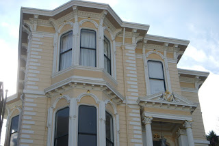
These are instantly recognizable as replacement windows—
the fake muntins between the double glazing is
a dead giveaway.
What kind of horrible person could find fault with a home improvement that saves energy?
You guessed it—me.

The improvement I’m talking about is window replacement. Some folks do it to reduce maintenance, others to update their home’s appearance. If your main motivation is to reduce your energy bills, however, there are many more cost-effective improvements you could make instead.

This house has lots of glass, but most don't—
the less glass, the less benefit you'll see from upgrading
your windows.
There’s no question that replacing single-glazed windows with new double-glazed ones will substantially cut heat loss through windows—typically by around 50%. What’s more, if your old windows are poorly weatherstripped, it’ll also reduce the infiltration of cold air. But that doesn't necessarily make new windows a good investment in energy savings.

Here's why: In the average house, windows constitute a relatively tiny fraction of the heated envelope—perhaps ten percent or so. This means that, while you may well be doubling the thermal efficiency of the windows, you are only realizing those savings on that ten percent sliver of the heated envelope, rather than on the whole envelope, as you would if you installed a new furnace. Hence, you’ll get far more bang for your buck by increasing attic and duct insulation, or better yet, replacing an obsolete furnace.

If your existing windows are really junk, you may
have a good reason to install high quality replacements
such as these.
On the other hand, if your windows have other problems--balky hardware, flimsy construction, or whatever--window replacement may be the right move. However, choose the replacements very carefully. If you have a prewar home with wood windows and you want to replace them with new color-coated aluminum or vinyl ones, make sure the replacements have the same hefty frame thickness and a similar finish.

 And unless your old windows are already white, avoid the tell-tale bright-white frames that are typically seen in replacement work.  Instead, choose a color that’ll complement your home’s existing color scheme.

Whatever you do, make sure that the replacement windows
won't detract from the look of your house. Basically, prewar
houses have thick window frames, and postwar houses
have skinny ones
Postwar homes with aluminum windows pose a special problem. For some reason, people who wouldn’t dream of ripping the wood windows out of a Victorian think nothing of scrapping their postwar home’s aluminum windows and substituting clunky white vinyl ones with fake muntins. That’s a mistake. The slender, flat, and unashamedly metallic look of aluminum windows is an integral part of this look. If the original windows are natural or bronze-anodized aluminum, insist on the same finish. Don’t arbitrarily “upgrade” to some other window type because it happens to be in fashion at the moment.

In sum, two suggestions: Don't bother replacing your old windows for energy savings alone--you'll never recoup those savings. Put the money into more effective measures first. And if you do have good reasons replace the windows, make sure the new ones will complement your house, not detract from it.

Monday, April 22, 2019

ARCHITECTURE THAT'S WEIRD, WACKY AND WONDERFUL

The Watts Towers: Once declared a nusiance
by the City of Los Angeles, they are now
a national historic landmark.
A number of my previous blogs on home styles have looked at what you might call “legitimate” architectural styles--mass-produced, popular and relatively buttoned-down stuff. But some of the most fascinating architecture of the twentieth century came neither from architects nor from professional builders, and can’t be fit any stylistic cubbyhole.  

Such works—sometimes classed as “naive” or “visionary” design—are the product of singular personalities refreshingly free of academic influences. Here is a sampling:  


Simon Rodia: "You gotta do
somethin' they never got 'em in the world."
•   In 1921 Sabato "Simon" Rodia, an uneducated Italian immigrant laborer, began building the first of a group of towers around his house in the Watts district of Los Angeles. Fashioned out of cement-covered steel bars and encrusted with fantastic arrays of shells, bottles, and bits of tile and glass, the tallest of the structures eventually soared nearly a hundred feet high. After laboring on the towers for thirty-three years Rodia, then 79, laid down his tools, deeded the property to his neighbor for nothing, and left Los Angeles. Of the now-famous Watts Towers he said simply,  “I had in mind to do something big and I did.”


Grandma Prisbrey—sans her vaccuum tube hat—
and a few of her inanimate friends at the Bottle Village.
•   In the mid-50s, “Grandma” Tressa Prisbrey found that her collection of 2000 pencils had outgrown her house trailer near Simi Valley, California. So she began building a small structure to display them, using a material that was cheap and plentiful--discarded bottles. Over the next twenty years, this humble beginning evolved into the Bottle Village, a 40-by-300 foot compound of 13 buildings and nine other structures, all built out of some one million bottles laid up in cement.  


An interior lit by amber glass bottles at the Bottle Village.
Prisbrey, who now and then sported a sun hat ringed with old vacuum tubes, also made daily trips to the dump, where she collected bits of broken tile, old headlights, and a cavalcade of other discards. These she lovingly inlaid into every square inch of paving  between her bottle structures, as well as into numerous free-form planters she built on the site. Prisbrey filled these planters with cactus, explaining:

“I don’t care much for cactus myself, but I don’t have a green thumb and if I forget to water the cactus they just grow anyhow. . .they remind me of myself.  They are independent, prickly, and ask nothing from anybody.”


The Winchester Mystery House: I don't know about the mystery part,
but it's a cracking good place to view Victorian and early Edwardian
architecture. (Image courtesy of Winchester Mystery House)
•  And of course, no account of wacky architecture would be complete without mention of Sara Winchester, diminutive heiress to the Winchester arms fortune. Supposedly plagued by the spirits of the untold men who had died at the business end of Winchester rifles, Sara consulted a fortune teller, who informed her that as long as she kept adding onto her modest San Jose farmhouse, she would not only escape their wrath, but would never die to boot. Psychics having had a good deal more credibility in the late-19th century, she immediately embarked on the remodel to end all remodels—a project that would last several decades and ultimately yield a spectacularly rambling Victorian/Edwardian house with 160 rooms. Among its idiosyncrasies: a seance room, a bell tower for summoning the spirits, and the pointed use of design motifs with 13 elements.  

All tour-guide puffery aside, the Winchester House remains a fine place to view the transition of architectural style from the late-nineteenth to the twentieth century—a wacky enough subject in itself.

Monday, April 15, 2019

BEAUTY BEGINS ON A STREET LIKE YOURS

We can have all the ugliness we're willing to put up with.
Picture this intersection I saw in a middle-class neighborhood near my Berkeley home, but which you could find in any town in the USA:  on one corner stands an aging fast-food joint; on another a ramshackle grocer.  On the third corner is—surprise!—an ill-kept liquor store. On the fourth corner there’s nothing at all—just a weed-choked empty lot.  

Ugly?  You said it. Yet in the past, whenever I’d drive through this dreary crossroads, I’d mentally excuse it with, “Well, you can’t expect to find beauty everywhere.”

But you know what? I don't pass things off that way anymore. Not only should expect to find beauty everywhere—if you don’t find it, by thunder, you should demand it.   

The Greeks considered beauty integral to well-being.
Nowadays, it’s become somehow sissified to insist that one’s built environment be beautiful—not just decent and functional, but inspiring to look at. Yet rather than being a quality that everyone can expect, beauty has become the exclusive franchise of architects, planners, and decorators—professionals who, let’s face it, are generally perceived as a bunch of wimpy prima donnas. We leave it to this lonely bunch to harp about the way things ought to look.  

 History tells us it wasn’t always so. The Greeks, those aesthetic rascals, sought beauty at every turn, and they weren’t embarrassed about it either—their prose alone makes that perfectly clear. Their successors, the Romans, may have lowered the hallowed Greek standards a notch or two, but they could still appreciate a well-turned arch of triumph when they saw one. 

The Japanese make most everything into
an aesthetic statement—even drinking a cup of tea.
The Japanese obsession with beauty is legendary, as evidenced by that culture’s art, architecture, landscape design, and even by its ritual tea ceremony. Nor is this eye for beauty confined to the wealthy--even the humblest Japanese home shows a fastidious concern for the pleasing arrangement of furniture, flowers, and food on a plate.      

In the United States of the late-19th century, concern with the declining quality of life in urban centers led to grass-roots improvement societies aimed at beautifying neighborhoods and creating public parks and amenities. By the turn of the century, such concerns were galvanized under the rubric of the City Beautiful movement, led by architects such as Daniel H. Burnham, who gave San Francisco a majestic—if yet-unfulfilled—scheme for its civic center, and whose executed plan for Chicago gave that city much of its downtown splendor.

Daniel Burnham's plan for Chicago, 1909—here looking
south down Michigan Avenue.
"Make no small plans; they have no magic
to stir men's blood."
“Make no little plans,” said Burnham, “they have no magic to stir men’s blood.  Make big plans, aim high in hope and work, remembering that a noble, logical diagram once recorded will never die.” 

How sad, then, that we’re willing to settle for so much less today: lookalike strip malls; acres of asphalt; crackerbox housing. I believe it’s not so much a shortcoming of the American character as a general sense that, with all the troubles we have as a nation these days, a beautiful built environment is just too much to expect.  

That’s a pity. Perhaps, like the Greeks, the Japanese, and even our own 19th-century forebears, we should consider the possibility that beauty is actually an integral part of a healthy society, and not just so much window dressing.  

Yet this is where we've ended up.
The mediocrity of so much of our built environment should tell us something, however: the search for beauty begins with the individual. It isn’t something to be ceded to planning bureaucracies—the jolly folks who brought us the blight of downtown freeways, cheerless housing projects, and retrograde design review boards, and who've also made damned sure that automobiles and not people remain king of the hill.

No, don’t hang your hopes on a change from without. Take a look around you. A more beautiful world could begin on a street like yours.

Monday, April 8, 2019

A COLONIAL TESTIMONIAL

Early colonial house in Deerfield, Connecticutt, c. 1734.
Note the massive central fireplace chimney.
(Image courtesy historic-deerfield.org)
Two hundred years ago, the Colonial house was king. Of course, it wasn’t called a Colonial at the time—it was just the nearest thing a New Worlder could get to a proper English house.

Most Colonial-era houses were based on English Medieval patterns from about 1600 to 1700. These were tough times, when settlers were ecstatic just to have a roof over their heads. 


As New England grew wealthier, colonial houses
became more elaborate. Note the flanking chimneys
on this example, a nod to English Georgian styles.
By the early 18th century, however, the scrappy Yanks were already doing their best to emulate England’s stately Georgian homes. Proper English stone was hard to come by in the New World, so the lush New England forests offered up the post-and-beam framing and clapboard siding that became a hallmark of these foursquare houses (though in the humid South, brick was the preferred material). Ornament, also of wood, was limited to entrance portals, decorative hoods above six-over-six double-hung  windows, and sometimes, a modest classical cornice.   


 Resurgent interest in the colonial era inspired many architects
of the late 1800s, including the celebrated firm of
McKim, Mead, and White.
(Isaac Bell House, Newport, Rhode Island, 1883)
Colonial floors plans were boxy and symmetrical in the Georgian manner, with a central stair hall flanked by the public rooms. While the earliest Colonial-era homes had been wrapped around a massive chimney in order to conserve heat, these more upscale versions adopted the impressive Georgian device of twin chimneys flanking the gable-ends.  The Yanks had truly arrived. But along with this new prosperity came changing tastes, and by 1780, the plain-spoken Colonial homes that had served so well lost favor and were forgotten for nearly a century.

The fact that there never really was a “Colonial style” per se—rather, just a Colonial era whose homes were based on English models—didn’t stop anyone from creating a Colonial Revival, however.  The movement traces its roots to Philadelphia’s Centennial Exposition of 1876, whose historical exhibits gave many fairgoers their first look at the relatively primitive homes of the early colonists.     


The wider availability of architectural photographs
printed in magazines and textbooks brought a more authentic
wave of Colonial Revival homes during the 1920s.
(Image courtesy of metanetworks.org)
The Exposition fanned America’s patriotism and reawakened interest in the homes of its earliest era. At first, this so-called Revival was just a pastiche of Colonial period motifs--broken pediments, Palladian windows, Classical porches--which were often rather unhappily wedded to otherwise standard late-Victorian houses.   
  
By the end of the nineteenth century, however, growing disgust with the clutter of Victorian architecture resulted in the chaste Colonial being held up as a stylistic ideal. In 1895, one architect opined, “. . .the old Colonial grace, simplicity, and refinements are sure to make a favorable impression in contradistinction to. . . lopsided design and cheap senseless ornaments.”


The mid-twentieth century saw the Colonial Revival style
boiled down to a few gimcracks such as window shutters
and weathervanes.
(Image courtesy of midcenturyhomestyles.com)
By 1915, a more authentic Colonial Revival appeared, brought on by the wider availability of books and measured drawings. Architects adopted the more severe, foursquare massing of the originals, and took pains to correctly reproduce such details as cornices and porches.

The straightforward simplicity of the style had tremendous influence on many architects, from McKim, Mead, and White on the east coast, to Julia Morgan, Bernard Maybeck, and Willis Polk on the west, all of whom were inspired by the Colonial’s ascetic composition.  Even later Modernists such as Charles Moore managed to reinterpret Colonial simplicity in their work.

 The most recent phase of the Colonial Revival occurred during the postwar era, when ranch-style tract houses were frequently done up in the kitschiest of Colonial emblems, consisting largely of false shutters, weathervanes, and brass eagles. But have no fear; in the current mania for mid-century modern architecture, these, too, have their adherents.

Monday, April 1, 2019

A PRIMER ON WOOD SIDING

Like many Colonial-era homes, the Nicholas Tyler Laundry
in Colonial Williamsburg features clapboard siding.
(Image courtesy colonialwilliamsburghotels.com)
Wood siding has been around about as long as houses have, although for obvious reasons, it’s rare to find examples that are more than a few centuries old. Despite its susceptibility to decay, the economy, warmth, and workability of wood siding have made it the customary exterior finish for a host of American home styles.

While wood siding is no longer the bargain it once was, its popularity has hardly diminished. Here’s a rundown of some of the most popular styles of horizontal siding (vertical siding would be a whole 'nother essay):

Drop siding was used to emulate the look of coursed stone,
as in this classic Italianate home in San Francisco.
Note the "quoins" or false cornerstones meant to further
the look of stone.
•  Board siding—better known as “clapboard”—consists of ordinary rectangular boards applied shiplap style to provide weather protection. Though rare today, board siding was popular in Colonial times thanks to its simple rectangular profile, which even the most primitive Yankee sawmill could crank out in quantity.

•  Channel rustic is variation of board siding. It has a tall lip that engages a shallow groove in the piece above, leaving an exposed horizontal channel.  It’s also known as “board-and-gap” due to the pronounced shadow effect this produces. Channel rustic made a brief comeback during the early postwar years, when its emphatically horizontal shadow line made it a natural for the low-slung Rancher homes of the era.   

•  Tongue and groove is yet another, more weatherproof refinement of board siding. It has a narrow tongue running along the middle of the upper edge which engages a corresponding groove above, exactly as wood flooring does.  “V-groove” tongue and  groove—bear with me here—has a beveled edge along the joint line that produces a heavier shadow than the plain variety.

This circa 1915 plan book house uses bungalow siding—a beefier version
of bevel siding—below the porch rail, and finely-textured "3-lap" siding
above.
•  Drop siding has a smooth vertical face topped by a wide, concave channel along the upper edge. Meant to imitate the mortar joint in stone masonry, it was ubiquitous on many Victorian home styles, including Italianate, Mansard, and Stick. The masonry effect was often reinforced by adding false wooden cornerstones known as quoins, and by faux-painting the siding to imitate stone. Like channel rustic siding, drop siding made a brief comeback during the postwar era due to its pronounced shadow line.

•  Bevel siding has a tapered profile, and comes with one face smooth and the other rough sawn. You can choose whichever side suits you. Common on Colonial Revival homes, it came back for a long encore during the Craftsman period, which demanded a shaggy, natural look.  In fact, a slightly beefier version known as “bungalow siding” was offered during these years, and was typically installed with the rough-sawn face exposed

Bevel siding mixed with shingle siding on the porch gable—but that's
another story. (Image courtesy LA Places)
"Dolly Varden" siding is a variant of bevel siding, but has a groove on the bottom or butt end that allows it to overlap the piece below for better weather resistance.

•  "Three-lap" is yet another variant of bevel siding that was popular in the early twentieth century;  here, a single piece of siding was milled to look like three narrow pieces, giving a fine texture without the extra installation labor.

•  Imitations of many of the above profiles made of various formulations of particleboard or hardboard are also offered by manufacturers of “engineered wood products”.  These sidings are reasonably durable as long as their dense surface layer remains intact—but once this surface is broken, it’s sawdust city.