Wednesday, May 29, 2019

BEHIND BARS: Window Security Grilles Needn't Be An Eyesore

Interesting, naturalistic window grille that does the job
just as well, but with a less threatening look.
Some years ago I visited a friend of mine, a Berkeley transplant, in the tiny town of Erie, Indiana. Erie—whose population as of the 2010 census was 554—consists of a crossroads with a scattering of houses and a church, all surrounded by cornfields as far as the eye can see. When I pulled into my friend’s driveway, I got out and reflexively locked my car doors, as I would at home in the Bay Area. She saw me and started laughing.

“You don’t have to do that here,” she said.

Alas, few places in the U.S. are as safe as Erie, Indiana. Most of us do have to worry about unwelcome guests, not just in our cars, but in our homes as well. As if that wasn’t bad enough, however, some of the things we do to make ourselves more secure have their own bad side effects.

Window grilles installed on the inside
face of windows. Remember that
grilles on bedroom windows,
whether inside or outisde, MUST be
openable to allow escape in case of fire.
In urban areas, it’s increasingly common to see neighborhoods in which every house has security grilles on the windows and doors. Ironically, to homeowners, visitors, and potential buyers alike, the perception of rampant crime suggested by obvious grilles can make a neighborhood of good people seem more dangerous than it really is. That in turn hurts property values and creates a downward spiral in neighborhood morale.

Contemporary window grille fabricated
to look like a traditional wrought iron detail.
Fortunately, there are a few simple things you can do to maintain security without making your house look like a prison, and without feeling like a prisoner yourself:

•  If you need security grilles on your windows, consider installing them on the interior rather than the exterior. They’ll be less visible from the street, and they can be partly screened by drapes or sheers on the inside. It’s also harder for a burglar to unscrew the grille mounting bolts when they’re inside the house.

An important caveat:  Remember that grilles on bedroom windows have to be openable so that occupants can escape in case of fire.

•  It's usually best to avoid grilles with a lot of decorative curlicues, since they just draw undue attention. For the same reason, consider painting grilles white or the same color as your window trim instead of the usual wrought-iron black. The grille fabricator can spray them with a rust-resistant primer, leaving you to put on the final color. If you already have grilles installed, consider repainting them the next time you paint your house. 

Your standard-issue motion-sensing
security lamp. . .
If you have the budget and inclination, a completely different approach is to make the grilles full-on artistic statements, as in the naturalistic window grille illustrated above.

•  If you want a little extra protection but hate the whole idea of using security grilles, one of simplest, cheapest, and least obtrusive ways to deter prowlers is to install exterior lighting activated by motion detectors. Since the lights only come on when there’s movement outside, they save electricity, and they won’t keep the neighbors awake by burning all night. They also turn off automatically during daylight hours. They’re available at very reasonable cost in any hardware store.  
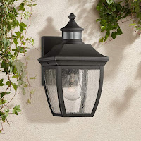
More importantly, lights activated by motion detectors will usually surprise prowlers, most of whom won’t stick around to see why the lights have suddenly come on. Occasionally, cats, dogs, or cars may set off the lights too, but it’s a small price to pay for the extra peace of mind.

. . . and a much more appealing version
that cleverly integrates
the motion detector in the hood.
(Image courtesy Lamps Plus)
•  Finally, remember the best security measure of all: a neighborhood unified against crime. Know your neighbors and get involved. Contact your local police department for information on programs such as Home Alert, tips on home security, and other ways to take back your neighborhood from crime.

Tuesday, May 21, 2019

SECOND THOUGHTS ON SECOND STORY ADDITIONS

Here's why you should be very, very careful in adding
a second story to your house. Ouch.
Travel down any residential street, and here and there you’re bound to find a few homes that scream, “Addition!” By most yardsticks, a good addition is one that’s invisible. Ergo, a detectable one is, by definition, pretty much a botched-up job. 

Ironically, if you design an addition well enough no one will ever notice it. While this may seem like a pretty sad reward for a job well done—particularly for the architect who's bent over backward to pull it off—it's still a lot better than the alternative.


How to produce an invisible addition? It’s not that difficult. Here are some guidelines to the fundamental decisions: 

• Don’t add on to the front of your house. Chances are its facade—quite literally, its "face"—was carefully composed by the original architect. Messing with it could end up turning the Mona Lisa into Mr. Potato Head. Take, for example, a very common addition commonly seen on L-shaped California Ranchers, in which a couple of extra bedrooms are expediently packed into the crook of the “L” beside the projecting garage.  The resulting U-shaped plan gives the facade a pug-nosed profile that projects too far toward the street and at the same time reduces the entry approach to a dark tunnel. In most cases, adding onto the front or side of the house is a better alternative.


Are you ready for this. . . . 
• Beware the old myth that adding a second story is the cheapest and easiest way to add space. It’s hogwash. On constricted sites where no reasonable alternatives exist, second-story additions can provide a fine solution. In most cases, though, it’s preferable to build at ground level.  Here’s why: 

Second-story additions often require reinforcement of the existing foundation, making them no less expensive and frequently even costlier than ground-level additions. They’re also inherently less space-efficient, since both levels lose appreciable floor area to the staircase.
But wait, tase.


or perhaps even this?
But wait, there’s more: It’s also much more difficult to integrate the towering bulk of a second-story addition into the design of the existing house, especially a quintessentially single-story design such as a Rancher or Bungalow. Last but not least, second-story additions are far more disruptive, since they involve the temporary loss of a rather crucial part of your house—the roof. 

If you weigh all these factors and are still convinced that a second-story addition fills the bill, push it as far back as you can to avoid a towering effect from the sidewalk.  

•  Take care to locate additions so they won’t cut off light to other parts of the house.  Consider where and at when the sun enters the existing windows (in every season, not just the one you happen to be in), and make sure the addition won’t throw crucial windows into permanent shadow. An extra bedroom or bath is no bargain if it makes other parts of the house unlivable.   

If you can’t avoid covering up an existing window, make sure it can be regained on another wall. Don’t figure on replacing windows with skylights—they won’t provide the same quality of light, and in some cases, building codes may not even allow it. And don’t resort to trading away south-facing windows for north-facing ones—you won’t get the sunlight or comfort level you had before.


Monday, May 13, 2019

WHAT COLOR AM I PAINTING MY HOUSE? MIND YOUR OWN DAMN BUSINESS

The Yonghe Temple in Beijing: No fear of color.
What could be more personal than a favorite color? Yet more and more people choosing exterior colors for their homes are finding this most personal of choices being restricted by their local design review board or their homeowner's association. It’s an imposition that’s fundamentally no different than having a stranger dictate the color of your clothes. 

All this is justified in the name of that contemptible concept, “good taste”, which at any given time is nothing more than the taste of those in authority. And the plain fact is that most design review boards are controlled by persons with a decidedly mainstream sensibility, which they righteously attempt to impose on everyone else. To their great dismay, not everyone’s color preferences are as sedate as those of central Europeans like me. And thank God for that, or America would be a pretty  boring place.  

A street scene in Burano, northern Italy. Why do we find color
charming in other places, but not next door to us?
Vivid colors are an integral part of many cultures, and always have been. The deep burnish of Chinese red bespeaks the whole rich history of that ancient culture; the gaily painted facades of certain Italian hill towns bespeak the humor and exuberance of Italy. Even the architecturally staid Swedes have a delightful tradition of painting their rural houses a blazing red—not, as I’d always thought, to furnish some winter color, but because the historically high cost of red paint long ago made it a status symbol.

Reconstructed actual colors
found on the frieze of the Parthenon.
Even the pristinely white temples of Greece, long held by highbrows to represent the apex of good taste, turn out to have been originally tarted up in an eye-popping array of primary shades.  So much for aesthetic pronouncements.

Colors have played such a large role in design history that some have lent their names to historical periods. In the United States, the proliferation of brownstone architecture during the 1870s earned that era earned that era the name Brown Decade; likewise, the 1890s were dubbed the Mauve Decade for their love of that royal shade. In fact, the entire Victorian era was notable for its lavish use of rich colors. 

Times change, however. Since Modernism swept the U.S. after World War II, mainstream architectural colors have seldom wandered too far from off-whites or mild pastels. Unfortunately, this fashion—and make no mistake, that’s all it is—has been institutionalized by civic officials who now feel entitled to nix any colors which cross the boundary of Butter-Mints pastels. Consequently, cultured people who deserve the freedom to make their own color choices must instead submit to having “acceptable” colors dictated to them on the grounds of good taste.  

Stortorget Square in Stockholm, Sweden: Red isn't the
only color the Swedes paint their houses.
But whose good taste? Taste varies the world over, and America is nothing if not an ethnic microcosm of the globe. It’s no coincidence that the colors often frowned upon by design review boards are the same vivid hues favored by many people of African, Hispanic, Asian, or Pacific Islander heritage. It’s nothing short of veiled racism for such colors to be banned on the basis of some arbitrary standard of taste that was most likely established by a bunch of Wasps decades ago.  

When confronted with this obvious bias, defenders of color restrictions retreat behind the same tired hypothetical question, along the lines of: “Well, how would you like it if your neighbor painted his house purple with green trim?”

Actually, these colors offend me much more than
any of the ones above. But no doubt the design review board
just loved them.
My response remains the same:  I’d much rather have a purple and green house next door to me than deprive any person—including myself—of the right to make his or her own choice.  Taste varies the world over. As far as I’m concerned, it’s nobody’s business what color I paint my house, and frankly, I don’t care what color you paint yours.  

Monday, May 6, 2019

WHY ARCHITECTS ARE NO LONGER "MASTER BUILDERS"

Architect Julia Morgan (1872-1957)
around the time she attended the
Ecole de Beaux-Arts, and. . .
The word “architect” is rooted in the Greek archi-tekton, meaning “master builder”. 
And once upon a time, that’s exactly what an architect was--a person whose comprehensive knowledge of construction made him the leader of a building project. It was the architect in the role of master builder, not merely designer, that gave that gave the world the Parthenon, Gothic cathedrals, and countless other creative triumphs.

Even as recently as the 1920s, architects such as Bernard Maybeck and Julia Morgan still spent a considerable amount of time on the construction site. Maybeck, the son of a woodcarver, delighted in working with his hands—he could often be found on his building sites gleefully experimenting with weird and wonderful new methods of construction. Morgan, the architect of William Randolph Hearst’s vast California estate, San Simeon, was the first woman to graduate from the prestigious Ecole de Beaux-Arts in Paris. 

. . .her masterpiece, William Randolph Hearst's Casa Grande
at San Simeon, California (begun 1919):
"Do it this way, friend."
(Photograph by Jake Seiner)
Conquering that male bastian no doubt demanded both determination and impeccable knowledge on her part. Hence the diminutive Morgan was especially well-versed in the nitty-gritty of construction—on building sites she was known to correct an errant worker by taking the tool from his hand and gently advising him, “Do it this way, friend.” 

Main door to architect Bernard Maybeck's
Church of Christ, Scientist, Berkeley (1910).
California: He could design the door,
and guess what—he could carve it too.
Photograph by Justin Zolli.
Well, things have changed, and not for the better. Today’s architects have an abundance of theoretical and aesthetic knowledge, but little practical understanding of how buildings are actually put together.  Most of an architect’s time is now spent in an office, well-insulated from the people who construct the buildings he or she has designed. For most architects, in fact, their closest encounter with the building process comes when construction problems—which are practically inevitable under this arrangement—compel them to visit the site.

There are a few maverick architects today who have tried to mend this estrangement of architects from architecture. Perhaps the best known is Paolo Soleri, whose Arcosanti project in Arizona has for decades struggled to offer architecture students a hands-on education integrating design and construction.

Paolo Soleri's Arcosanti , north of Phoenix, Arizona,
which architecture students have labored on since 1970:
An architectural education like no other.
(Image courtesy travel2arizona.com}
Yet such practical learning opportunities remain rare. One reason for this is that few modern-day architecture schools seem willing to acknowledge the historical connection between the design of a building and its construction. Hence, the separation of the design and construction processes has been all but codified. 
Building a Gothic cathedral:
The architect also knew how to
build it—something almost unheard
of today.

The problems resulting from this state of affairs are legion. The success of any object, whether a vase, a violin or a building, depends on its designer’s intimate familiarity with the process of its creation.  Separate the two, and both are diminished.       

Can the architects ever return to their historic role of “archi-tektus”? In the strict sense, perhaps not. A cathedral, for all its aesthetic sophistication, is really just an artfully-arranged pile of stones: it’s well within human comprehension. A modern-day building, however, with its complex structural, mechanical, and electronic systems, is all but beyond the grasp of a single mind.

But that’s not to say that architects can’t learn by doing. Divorcing the design process from the building process, as so many architecture schools continue to do, can only further undermine the historic role of architect as master builder.