Monday, June 29, 2020

THE QUALITY KILLERS

He couldn't cope: The interior corners of ceiling modlings
should be coped rather than mitered—but not like this.
A few years back, I came across a bronze plaque outside the headquarters of one of those instant internet giants. In consummate public-relations prose, its text declared the company’s absolute commitment to quality and excellence at every level, invoking all the usual corporate buzzwords of that genre. What really fixed the plaque in my memory, though, was that one of its most mundane phrases was mis-punctuated, reading “it’s ideals” instead of “its ideals”.  

Given this firm’s purported obsession with quality, you’d think they’d have given their mantra a quick proofread or two before committing it to bronze. 

This incident reminded me that a commitment to quality demands tangible final results, not just a lot of high-flying babble. It requires vigilance down to the very last detail--even to a lowly apostrophe.

Molding made of multiple parts should be
overlapped to avoid obvious joints like this.
Quality relates to architecture and construction in much the same way:  The last little details can make the difference. Hence, a project that’s going along swimmingly can still become a compete messin the last few days, because that’s when many of the parts you really notice are completed. The trouble is, this is just about the time the owner, the contractor, and yes, even the architect are tired, impatient, and rushing to get things buttoned up. 

Too often, this means that the most conspicuous details get the least effort and attention.
Here are some notorious quality killers that can sabotage a project at the last minute:

Leftover shreds of masking tape are a
sure sign of a contractor in a big hurry.
•  Moldings such as baseboard, door trim, and ceiling cove are often treated as last-minute frou-frou by harried contractors, even though they’re among the most obvious finish items.  Quality killers include inaccurate or open miters, ragged or splintered cuts, and gaps between moldings and floors, walls, or ceilings.  All standing moldings (such as door trim) should be installed plumb and square.  Running moldings (such as baseboard) should align properly and have clean, tight miters, or in the case of internal corners, coped butt cuts.  Gaps should be neatly caulked.  The last step, mind you, is seldom carried out but is a must for any quality installation.  

Heavy brush strokes shouldn't be visible in trim—a particular
problem if the paint finish is high gloss.
•  Indifferent painting is the surest way to destroy a quality job.  Ironically, although paint is the predominant finish on most houses, the painting phase is often cursed from being carried out late in the project, when money and patience are at low ebb.  Hence, workmanship suffers either because the job is rushed or because incompetent painters are hired in a misguided attempt to save money.  The quality killers:  Excessively thick or thin application, drips and runs, ragged or wavy brushwork along edges, and paint on fixtures, finish hardware, masonry, or glass.  None of these shortcomings should be tolerated.

Crooked switches indicate an electrician in an all-fired
hurry to get off the job. It takes time to straighten out
the electrical devices, but if you don't, the cover plates
will always be crooked.
•  Highly conspicuous finish hardware items such as door locksets, cabinet pulls, towel bars, grilles, and the like usually get hasty treatment because they’re among the very last items installed.  The quality killers include mismatched finishes (polished brass mixed with satin brass, for instance), off-plumb or misaligned pulls and trim plates, crooked light switches and receptacles, crooked towel bars, and locks and catches that don’t engage properly. Insist that such items are neatly installed and are placed perfectly plumb, level, or square, as appropriate.

And in case you think fussing over such details is obsessive, one last remark about that would-be internet giant with the big bronze plaque:  “its” since gone out of business.

Monday, June 22, 2020

AIRPORT ARCHITECTURE: Same Old Approach

Union Station, Washington DC: In the heyday of
rail travel, you really knew you were going someplace.
(Architects: Daniel Burnham and. Ernest. R. Graham, 1907)
Flying isn’t what it used to be. While the coronavirus and stay-at-home orders may become the proverbial nail in the coffin for the romance of travel, things were on the decline long before that. By the 1990s, air travel had already become overly familiar, even routine; but that was before 911 made many Americans equate airplanes with doom and destruction. But there's another, literally concrete reason that flying has lost much of its romance:  The modern urban airport just isn’t the sort of place we’d like to spend time in.  

The mechanics of travel weren’t always something merely to be endured. During the heyday of the passenger railroads, arriving, departing, or even just hanging around in one of the great major terminals--whether Portland, Cincinatti, or Washington DC--was an experience to remember. A first-time visitor couldn’t help but feel thrilled in such a temple of travel. 

Exterior of the main terminal at Atlanta's Hartfield-Jackson
International Airport. It's the busiest airport in the US—
and perhaps one of the least attractive.

Approaching an unfamiliar airport, on the other hand, more often elicits a rising sense of dread. Even the most architecturally celebrated of them are maddeningly difficult to navigate. For example, after an eternity of construction bedlam, San Francisco’s airport finally boasts a magnificent new International Terminal. Yet reaching it from either the highway or from public transportation remains a nightmare for any first-time visitor.  

Most of us navigate airports by one of three methods, the only reliable one of which involves already knowing the way. Failing that, we walk around slack-jawed, trying to figure out directional signs that ought to be obvious, or else we simply follow the crowd and eventually stumble onto our objective.

Santa Barbara, California's charming municipal airport.
(Architects: William Edwards and Joseph Plunkett, 1942)
With all this confusion within, don’t even ask about what airports look like from the outside. What with changing technologies and endless reconstruction, architects long ago gave up trying to give airport exteriors a unified appearance.

Of course, there was a time when airports, like railroad terminals, were designed to look all-of-a-piece. Among the few that survive largely intact are the modest but remarkable Spanish Revival gem in Santa Barbara, California. 

Architect Eero Saarinen's TWA terminal at New York's
JFK airport really got the "architecture inspired by flight"
design theme a standard, not to say trite, theme for airports.
When Modernism hit town, though, it became fashionable for airports to be inspired by the objects they served:  aircraft.  This was a refreshing concept back in the early 1960s, when Eero Saarinen completed his famously swoopy TWA terminal at New York’s Kennedy (then Idlewild) Airport.  Alas, architects have drunk from the same well countless times since--albeit without Saarinen’s audacity--thereby turning the concept into a well-worn cliche.

In the ensuing decades, it’s become acceptable for airports to be disjointed aesthetic jumbles so long as they vaguely resemble airplanes, with lots of shiny metal, curvy plastic panels, and carpeting on the walls.  Never mind that there’s no intrinsic reason why an airport lounge should look like the cabin of a 747, any more than your garage should look like the inside of a Toyota.

Wichita, Kansa is a city long associated with aircraft
manufacture, and its airport features the usual aircraft-like
interior. But would you build your garage to look
like a Toyota? 
Today, with the growing despair over security, overcrowding of terminals and airplanes, and the now even-shakier financial shape of the airline industry, airport architecture seems likely to remain stuck in the plastic-and-stainless steel rut it has occupied for decades. 

Rail travel never did regain its cachet after World War II, and the palatial terminals of railroading’s golden age sadly gave way to mundane structures that could barely compete with the local Greyhound station.  Likewise, perhaps, the airport’s day as a romantic portal to other worlds has been doomed by the very ordinary thing that air travel has become.  Short of rocket rides to the moon, I wonder what can replace it.  

Monday, June 15, 2020

AN ENLIGHTENING POST ON LIGHTING

The Welsbach gas mantle was the most advanced type
of lighting fixture through most of the Victorian era.
Next time you head for the bathroom in the middle of the night, consider what the casual act of lighting your way would’ve entailed just over a century ago: If you were lucky enough to have a house with piped-in gas, you could strike a match to the nearest gas mantle to get a blinding white flame. Otherwise, you’d have to stumble your way to the john by the light of a guttering candle. No wonder so many Victorian houses burned to the ground.

Although nowadays it’s hard to imagine a world without electric lighting, it's been with us for a relative wink of an eye. Thomas Edison perfected his incandescent bulb in 1879, after trying out hundreds of filament materials ranging from bamboo to hair to paper (he finally settled on tungsten). Not so well known is that Edison also had to invent a way to evacuate the air from the bulbs--no mean task using Victorian technology.  

Thomas Edison and the light bulb he perfected in 1879.
Others had pioneered the idea of electric lighting,
but Edison made it practical.
Even so, it took another twenty years or so before electric lights had largely replaced gas mantels in American homes. As late as the early 1900s, older houses with gaslight were still being retrofitted for electricity. These transitional houses are easy to spot: the wires leading to the electric fixtures were often run inside the old gas pipes. 

In the early days of electric lighting, fixtures intentionally flaunted naked bulbs so that no one could possibly mistake them for gas.  It was a way for people to advertise their modernity, much as hipsters of the 1990s sported conspicuous cell phone antennas on their cars.

The first neon sign in the U.S. was a Packard automobile
advertising sign, circa 1924, similar to this one.
Since that time, there have been surprisingly few fundamental changes in residential lighting.  Switches and wiring were eventually hidden inside of walls instead of being mounted on top of them, but other than that, most houses continued to have lighting fixtures in the center of ceilings, much as they had in the days of gaslight. The Revivalist home styles of the 1920s brought a craze for wall sconces--another gaslight derivative--but the fashion had largely died out by the end of that decade.

The first really new development in lighting since Edison’s light bulb was neon tubing, which made a big splash in the early 1930s. It made its American debut in a sign for a Packard showroom, and was soon all the rage as signage in movie theaters and other commercial buildings. However, with its otherworldly glow, it found little use in residential design.  

Fluorescent lighting was the height of modernity from the
1940s all the way through the 1970s, despite suspicions
about its negative effects on behavior.
Fluorescent lighting (not to be confused with neon) was introduced not long afterward.  Being diffuse and hence glare-free, and also producing much more light for a given amount of power, it quickly became the standard for commercial buildings.  Still, no matter how hard architects tried to push its use in luminous ceilings and other Modernist lighting concepts, the sickly blue-green quality of its light did not endear it to homeowners. It took another forty years of improvement, as well as laws mandating its use, before fluorescent lighting was grudgingly accepted into American homes.

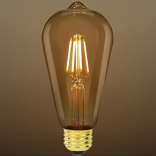
Today, we've come full circle, with reproduction light bulbs
mimicking Edison's originals. The important difference is,
they use about 1/5 as much energy to produce the same
amount of light, and last many times longer.
In the interim, a number of other high-efficiency lighting types have been developed, including mercury vapor, sodium vapor, and metal halide, but the unnatural spectrum of light they produce has also precluded their use in domestic work. 

By contrast, halogen residential lighting, introduced during the 80s, was an instant hit with the public. Why? Halogen’s warm, yellow-white light is very close to the spectrum of sunlight. Accordingly, engineers are currently working hard to make the current generation of high efficiency lighting—LEDs, for "light emitting diodes"—as warm and friendly as incandescent and halogen lamps.

Because the sun, after all, is still everyone’s favorite lighting fixture.  

Monday, June 8, 2020

ART CHANGING ARCHITECTURE: It Goes Back Centuries

The evocative etchings of
Giovanni Battista Piraneesi (1720-1778), with their
moody representation of Roman ruins, influenced the rise
of the architectural style known as Romantic Classicism.
A few years years back, a housing tract inspired by the late mass artist Thomas Kinkade’s bucolic townscapes and happy-happy cottages opened near Vallejo, California. Many people found this idea amusing, if not horrifying. But while there’s much that can be said of Kinkade’s trademark painting style--none of which I’ll say here--there’s nothing new about architecture being influenced by art. It’s been happening for centuries.  

During the 1600s, for instance, the dynamic forms, layering of space, and dramatic use of light found in Baroque painting enormously influenced concurrent Baroque architecture.  In the middle of the next century, the Italian G. B. Piranesi’s engravings of ancient Rome foreshadowed the rise of Romantic Classicism, an architectural style whose austere, sharply-drawn classical forms went on to dominate the 1800s.  

The work of Claude Lorrain (this is "Landscape with Nymph
and Satyr Dancing," circa 1646) helped inspire the English
Picturesque movement in landscape design and architecture—
though not until a century had passed.
Piranesi’s Carceri, a volume of engravings containing eerily atmospheric depictions of imaginary ruins, was especially influential to a branch of Romantic Classicism known as the Sublime.  Set in motion in the late 1700s by the otherworldly designs of the Frenchmen C.-N. Ledoux and and L.-E. Boullee--many never built, some perhaps not even buildable--architects of the Sublime school used stark geometric forms raised to colossal scale to evoke feelings of awe bordering on apprehension.  

The Italian Futurist Fortunato Depero representing
"Ships and Tunnels", (1930). The Futuists helped steer
architecture away from mimicking the past and into the
forward-looking Art Deco and Moderne eras of the 1930s.
Meanwhile, a romantic style of landscape painting gave rise to architecture’s Picturesque movement, whose work aimed to capture the rustic charm of naturalistic art in three dimensions.  An early Picturesque landmark of 1744, the English garden of Stourhead, was in fact literally based on a landscape painting by Claude Lorrain done a century earlier.  Later Picturesque works in England, such as the thatch-roofed peasant cottages conjured up by royal architect John Nash in 1811, continued to exploit the romance of Picturesque art--perhaps the closest historical parallel to those tract homes based on Kinkade’s work.


Piet Mondrian: "Composition with Large Red Plane, Yellow,
Black, Gray and Blue" (1921). Such rectilinear geometry
profoundly influenced postwar Modern architecture.
While representational art might seem more likely to inspire architects, abstract art has had, if anything, a more powerful influence.  During the Teens, the work of the Futurists--an art movement that deified technology to an almost nauseating degree--was soon reflected in the architecture of the Russian Constructivists, whose startling mechanistic projects of the Twenties might have been widely influential had they not lost favor with Joseph Stalin soon afterward. 

The Modernist architects Le Corbusier and Walter Gropius had close links with both Expressionism and with the Dutch movement known as de Stijl (Corbusier himself was a painter early in his career).  The rectilinear geometries of de Stijl artists such as Piet Mondrian and Theo van Doesburg profoundly influenced Modernist floor plans and elevations, many of which resembled abstract art in themselves.  

This year's Thomas Kinkade calendar: How will his work
affect architecture of the future? Or has it already?
Unlike most of the foregoing examples, of course, Kinkade hardly represents the artistic vanguard of his era.  Still, the fact that many laypersons--not to speak of critics--consider his work banal doesn’t mean Kinkade’s influence can be dismissed.  Norman Rockwell’s paintings were long considered to be sentimental dreck;  critics pointedly referred to Rockwell as an “illustrator”, refusing to dignify his work with the label of art.  Today, in the more generous light of retrospect, Rockwell is widely considered an American original.  

Whether you love it or hate it, Kinkade’s work seems to have the same sort of mainstream appeal that Rockwell’s art once did, and his status may someday be equally enhanced by time.  Whether this bodes a coming generation of candyland cottages, their windows all aglow, we can only imagine. 

Wednesday, June 3, 2020

CASUAL MURDER

How quickly things can change in a week. It now seems trivial for me to hold forth on the fine points of art and architecture after we've seen a handcuffed black man oh-so-casually put to death before our eyes. One would not treat a dog lying in the street the way police officers treated George Floyd. 

Like most white people, I was raised to respect the police who, for whatever reason, are willing to do a job most of us sure as hell wouldn't want to do. But there is a clear bottom line of human decency in how we treat our fellow man, and again and again they have crossed it. 

Further amplifying this tragedy is a president who now seems even more determined to make hatred the coin of the realm. A man so self-absorbed he thinks nothing of having peaceful protesters tear gassed in order to stage a campaign photo of himself holding a Bible. 

I've already made my feelings about Mr. Trump abundantly clear in other essays and won't start in again here. I would only say this: Up until this January, we've all been incredibly lucky this president hasn't had to deal with an actual crisis. Now that we've got three of them at once, he is liable to get Americans—and I mean all Americans—into some real trouble.

I'll return with a regular architectural topic next week when, hopefully, we will have at least moved a few steps forward in what promises to be a long, long journey.