Monday, June 24, 2019

WHAT'S GREEEN REALLY MEAN?

Author's Note: I'll be at my home-away-from-home in Suzhou, China for the months of July and August, and because those big bad socialists block Google and therefore Blogger, I won't be able to post new Architext blogs while I'm there  So, dear readers, I'm choosing a few of my favorite past blogs for an encore presentation. Hopefully you'll find them worth a repeat or, if you haven't read them before, an interesting first.  —Arrol Gellner

What’s the greenest way to build? Using natural, renewable resources? Using salvaged building materials? Or using the same old stuff you’ve always used, which some corporate PR firm has now managed to repackage as “green”?

These are all ways to profess greenness, some effective, some merely gestural. But by far the greenest approach to construction is to adapt buildings that already exist--and that’s one avenue in which we Americans still fall woefully short.
This building was demolished to make room for—
no kidding—a casino parking lot.
(Columbia Building, Pittsburgh, destroyed 2011;
courtesy of enthusiasticnoise.blogspot.com)

We are, after all, a young nation built largely from scratch, and we consider it normal for our built environment to be in a constant state of upheaval. Here, it’s common for buildings to be demolished after fifty, thirty, or even ten years of use--and the expected life of buildings is getting shorter, not longer.

One study has pegged the average lifespan of American buildings at just shy of fifty years. Compare this to Europe, where a building’s life is measured in centuries rather than decades. The average life of an English building, for example, is 132 years. The typical lifespan of buildings on the Continent is probably even longer if we discount the effects of two World Wars. 

San Francisco's Ghirardelli Square—
a repurposed chocolate factory—
was among the first great
examples of "adaptive reuse".
America’s obsession with change, however, leads us to build quickly and on the cheap, since it’s assumed that buildings will be obsolete in a few decades anyway. Such thinking naturally leads to a vicious cycle of wastefulness: Because permananence is considered irrelevant, buildings are worn out in a few decades whether they’re actually obsolete or not. These, in turn, are typically replaced by structures that are even shoddier and more temporary--whether theoretically green or otherwise. 

Preserving and reusing older, well-built existing structures, on the other hand, is the ultimate expression of true green design, since it requires relatively little additional expenditure of energy when adaptation is required, and occasionally, none at all when it isn’t. 

The average old building represents a vast investment of energy--not only in the form of materials, but more importantly, in the form of labor (and by “old”, let’s assume we mean those built before World War II). It’s self evident that old buildings typically used more opulent finishes than their modern counterparts; they were, after all, built at a time when high quality materials had not been depleted and were still used generously. 
The crafts that built interiors like this one—
the Los Angeles Theater—are not coming back at
prices anyone can afford. 

What is less seldom appreciated, however, is that an old building also embodies an enormous storehouse of labor--much of it of a kind modern society can no longer afford. Many once-ubiquitous building trades have all but disappeared over the last century--from stonemasons to stained-glass makers, from plasterers to gilders--and the fruits of their labors remain in every extant building, essentially frozen in time. 

These skills won’t be coming back, except in their current status as boutique trades carrying astronomical costs. Hence, destroying an old building doesn’t just squander physical resources--it also negates forever a huge investment of skilled work that’s no longer affordable and sometimes no longer even obtainable. To my mind, this is a waste of nonrenewable resources more tragic than that of any precious material.

BACK IN THE DAYS OF ART DECO

Author's Note: I'll be at my home-away-from-home in Suzhou, China for the months of July and August, and because those big bad socialists block Google and therefore Blogger, I won't be able to post new Architext blogs while I'm there  So, dear readers, I'm choosing a few of my favorite past blogs for an encore presentation. Hopefully you'll find them worth a repeat or, if you haven't read them before, an interesting first.  —Arrol Gellner

La Maîtrise Pavillon for Galeries Lafayette, among the
fantastical structures that introduced the public to Art Deco
at the Paris Exposition in 1925.
In April 1925, an exposition opened in Paris that was to influence American design for the next twenty years. It carried the unwieldy moniker: L’Exposition Internationale des Arts Décoratifs et Industriels Modernes . However, the name of the style it gave birth to is short and sweet: Art Deco.

The Exposition was meant to showcase only the most modern European design, whether in architecture or consumer products, so no historically-based decoration was allowed.  Instead one found a gaggle of fresh new motifs based on simple geometry: chevrons, flutes, zigzags and rays, as well as some highly stylized floral forms.

 William Van Alen's Chrysler
Building of 1930, whose pinnacle
is perhaps the best known
Art Deco structure in America.
By 1926, such design—which would not be called Art Deco until long after the fact—was already filtering into the American psyche via shop displays and movie sets. Also that year, architect Timothy Pfleuger wowed San Franciscans with his pointedly non-traditional Pacific Telephone Company building, thereby putting the style on the architectural map as well. In 1930, architect William Van Alen completed perhaps the most famous Art Deco structure around, the Chrysler building. In 1931, Pfleuger doubled down with his spectacular Paramount Theater in Oakland, another acknowledged masterpiece of the Art Deco era.

Art Deco remained a commercial style for the most part, yet residential architecture couldn’t help but be affected by it. For those architects and builders brave enough to break away from the traditional styles of the day, Art Deco brought a whole new look to housing. In many ways, it emulated Bauhaus design, with its flat roofs, curved walls, and bands of windows; yet true Bauhaus adherents would have been aghast at the further addition of strident colors and wild geometric motifs such as ziggurats, sunbursts, and lightning bolts.

The lobby of the Oakland Paramount Theater, designed by
Timothy Pfleuger and completed in 1931,
features the ultra-Deco "Fountain of Light".
In the mid 1930s, Art Deco branched into a related style known as Streamline Moderne. Its features were derived less from the Paris exposition than from industrial designers such as Raymond Leowy, who throughout the decade had been madly reshaping everything from typewriters to steam locomotives to mimic the fluid lines of modern aircraft. In 1935, Leowy painted “speed lines”on the nose of the Pennsylvania Railroad’s new streamlined S1 locomotives, suggesting the streaking of an object in motion. Ironically, this decorative device became a favorite motif on Deco and Moderne homes as well, despite the fact that these houses clearly weren’t going anywhere.

Raymond Loewy poses on the Pennsylvania Railroad's
S1 locomotive of 1939, whose heavily speedlined cowling
gave it a look of motion even when standing still.
By the eve of World War II, the palette of Deco/Moderne was well defined: stucco walls (often curved); glass block (often curved as well); steel casement windows; vitreous tile (an opaque glass wall finish available in various colors, though most commonly found in black);  stainless steel and chrome accents; and the now-familiar geometric ornament in low relief.

In years after World War II, a renewed sense of American pride led buyers back to the more home-grown look of Colonials and Ranchers, and the high-voltage era of Deco/Moderne quietly faded out like a dying battery. Since the style never really caught on with tract builders, Art Deco residences are quite rare, often appearing singly among the more popular bungalows and cottages of the era.

A small Art Deco jewel in San Franciso, circa
the late 1930s.
(Image courtesy of decopix.com)
The unique design of Art Deco and Moderne homes brings with it a number of characteristic troubles. The flat roofs and lack of overhangs beloved by this style often translate into maddeningly persistent leaks, as do the often poorly-waterproofed stucco details. Also, the  ubiquitous steel sash found in these houses—the leading-edge window technology of the 1930s—has a propensity to both rusting and sticking shut due to accumulated layers of paint.  

But hey, a Deco jewel is worth a little trouble, oui?

EICHLER HOMES: The Ulitmate In Mid-Century Modern

Author's Note: I'll be at my home-away-from-home in Suzhou, China for the months of July and August, and because those big bad socialists block Google and therefore Blogger, I won't be able to post new Architext blogs while I'm there  So, dear readers, I'm choosing a few of my favorite past blogs for an encore presentation. Hopefully you'll find them worth a repeat or, if you haven't read them before, an interesting first.  —Arrol Gellner

Back in 1963, a reporter asked developer Joseph Eichler, "What do you call your homes, contemporary or modern or what?”

“I call them Eichler homes,” he responded. “There’s nothing else like them.”

With their dramatic facades, breezy interiors and Californian focus on patio living, Eichlers are still standouts today, a half-century after their inception.

Joseph Eichler, dairy executive turned
developer and architectural visionary.
Between 1949 and 1967, over ten thousand Eichler homes were built in San Francisco Bay Area suburbs such as Sunnyvale and Palo Alto, along with 900 or so more in Southern California. They were the brainchild of Joseph Eichler, a wealthy dairy executive with no background in design. However, Eichler had briefly lived in a home designed by Frank Lloyd Wright, and wondered why such houses couldn’t be made affordable to everyone. He was finally inspired to take on the task himself. He hired the respected architect and Wright disciple Robert Anshen of the Los Angeles firm of Jones & Emmons to design the initial Eichlers, and the first prototypes were built in 1949. During the next eighteen years, a whole range of uncommon Eichler designs emerged, including later versions designed by the San Francisco firm of Claude Oakland & Associates and the

In Eichler homes, acres of full-height glass
reflect a time when energy was dirt cheap.
(Image courtesy of eichlerhometour.org)
Eichler homes had a host of unorthodox features, including post-and-beam construction, slab floors with integral radiant heating, and a standard second bathroom. Later models introduced the unforgettable Eichler atrium, an entrance foyer that daringly straddled the line between indoors and out. Exteriors featured vertical siding, flat or very low-sloped roofs, and shockingly blank street facades. At the side and rear walls, however, great sweeps of glass brought the outdoors in, without so much as a step to interrupt it.

The daring Eichler atrium straddled
the line between indoors and out.
Everything about Eichlers seemed light, fresh and modern in comparison to the dowdy postwar homes that glutted the market, and the houses quickly became a sales success. Yet they never garnered more than modest profits for their developer, due mainly to their unusual design. Although his associates urged him to make the houses more conventional, Eichler refused. Sadly, the realities of the housing market eventually caught up with him, and Eichler Homes filed for bankruptcy in 1967.  Joseph Eichler continued building custom homes for another five years until the 1973 recession made that, too, untenable. He died in 1974.

Eichler's modular post and beam system
looked spectacular, but could make adding on
a real challenge.
Since then, time has brought a number of Eichler shortcomings to light. Bedrooms are cramped by modern standards, and the thin, mahogany-paneled walls, hollow doors, and free-standing partitions make the interiors unusually noisy. The innovative radiant heating system proved troublesome, and the modular post-and-beam framing can make sensitive remodeling a challenge.

However, the home’s single greatest shortcoming couldn’t have been anticipated by Eichler or by his architects: Designed during an era of dirt-cheap energy, Eichlers made extravagant use of glass and were poorly insulated. As energy costs soared during the 70s, Eichlers proved disastrously inefficient—and unlike homes with attics and conventional windows, there was no quick retrofit available.

For these reasons, as well as Modernism’s fall from favor, the Eichler will forever remain emblematic of the 1950s and 60s. But what an emblem! Though Joseph Eichler’s uncompromising vision may have brought him financial ruin, his legacy has proved more permanent.

NIGHTMARE ON PALM STREET

Author's Note: I'll be at my home-away-from-home in Suzhou, China for the months of July and August, and because those big bad socialists block Google and therefore Blogger, I won't be able to post new Architext blogs while I'm there  So, dear readers, I'm choosing a few of my favorite past blogs for an encore presentation. Hopefully you'll find them worth a repeat or, if you haven't read them before, an interesting first.  —Arrol Gellner

A while back, driving through an old and well-to-do suburb of San Francisco, I came upon a charming street flanked by swaying palm trees and lined with classic Craftsman bungalows. Practically all of them had stout columns of river rock, massive beamed porches, and lovely leaded glass windows--in short, all the attributes today’s bungalow connoisseurs covet.

Classic bungalow in Alameda, California, circa 1911.
There was just one problem: Although the original architecture of those homes had been remarkably consistent, at least half of the them had been badly mauled by inept modernizations or ham-handed expansions that had taken place in earlier years--erstwhile ”improvements” that in the long run destroyed their architectural value.


By far the most common transgression was the replacement of the original wooden windows with clumsy, glaring white vinyl windows ones. These windows are today’s equivalent of the cheap aluminum sliders that defaced so many fine old Victorians during the postwar era. Regardless of what vinyl window sellers may claim, and regardless of what kind of “historical” muntin patterns they may offer, these windows are not suitable for installation in any vintage home style--least of all the emphatically woodsy bungalow. 

Another great bungalow, this one with not-so-classic
vinyl replacement windows.
But a nasty outbreak of tacky windows wasn’t all that had gone wrong on this erstwhile remarkable little street. Some homeowners had apparently found their premises a little too cramped and, lacking enough property to add to the back of their homes, instead built enormous, looming second story additions that were the visual equivalent of a jackboot stomping on Bambi.

Other less egregious but equally irreversible damage was done by owners who, in an apparent attempt to keep up with some color fad or other, had painted over their bungalows’ natural river rock on columns and chimneys.

The sad thing about these various desecrations is that they were all unnecessary. Old wood windows, for example, can generally be repaired for less money than it costs to install second-rate vinyl replacements. Moreover, the energy savings gleaned by switching to double glazing--the motivation for many replacement projects using vinyl windows--is trivial compared to the same investment made in a more efficient furnace or higher insulation levels.

A bungalow addition gets off to a bad start.
Note the overpowering mass, uncharacteristic hip roof,
 and the means of extending the chimney.
Additions, even on a tight site, needn’t detract from a home’s architecture. Even second story additions can be designed to minimize their visual presence, with detailing that blends in with the original architecture rather than clashing with it.

Neither should the foregoing suggest that it takes a big budget to thoroughly wreck a vintage house--all it really takes is one trendoid fool with a paint brush. While painting a house solely in to keep up with color trends is merely a waste of time and money, painting over natural stone or brick for the same purpose is self-inflicted sabotage. The damage is, for practical purposes, irreversible, and the punishment is inevitably meted out when it comes time to sell.


Take that lovely little palm-lined street, for example. The very owners who refrained from “modernizing” are the ones whose homes will be valued most highly at sale time. The ones who made inadvisable and half-baked “improvements” end up the losers.

DESIGN REVIEW: A Jab In The Eye Of The Beholder

Author's Note: I'll be at my home-away-from-home in Suzhou, China for the months of July and August, and because those big bad socialists block Google and therefore Blogger, I won't be able to post new Architext blogs while I'm there  So, dear readers, I'm choosing a few of my favorite past blogs for an encore presentation. Hopefully you'll find them worth a repeat or, if you haven't read them before, an interesting first.  —Arrol Gellner

How would you like a committee deciding what clothes you could wear each day?

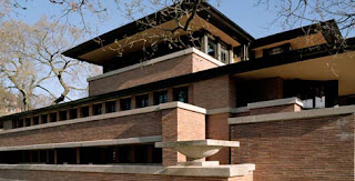
Frank Lloyd Wright's famed Robie House of 1909:
If design review boards had existed at the time,
it would never have been built.
One member might say,  “Sorry—those pants don’t match the surroundings. We think you should try another pair.” Another would add,  “We don’t care for that jacket. It attracts too much attention.”
A third would pipe in with,  “We’d prefer to see a blue shirt, okay?”

There’s a similar institution in many of our city planning departments. It’s called a design review board, and it presumes to tell architects and homeowners what “clothes” their homes are allowed to wear. In many cities, design review is required whenever a set of residential plans is submitted for approval.

Harry Oliver's Spadena House, Beverly Hills (1926):
Would it pass the Design Review Board
in your town? Not bloody likely.
Over the past thirty years, the design review process has exerted an ever-expanding influence on architects and homeowners. But in all that time, no one has really been able to demonstrate its value in making our surroundings more “beautiful”—whatever that really means.

Design review is based on the shaky premise that a panel of city appointees can judge aesthetics better than anyone else, and should therefore have the final say on what your project should look like—more of a say, even, than you or your architect.

Beauty is a highly individual perception, however. What’s more, our judgment of aesthetics is inextricably rooted in the context of our own time. Architecture that we find ugly or shocking today may well be perfectly acceptable in twenty years. Conversely, the features design review boards love to see nowadays may be considered schlock in a few decades. You se always on shaky ground simply can’t presume to make airtight aesthetic judgments from the vantage point of the present.

Bruce Goff's Bavinger House (Norman, Oklanhoma,
1955—now destroyed): Another non-starter
if Design Review Boards had had anything to do with it.
If design review boards had existed during the time of Frank Lloyd Wright, for example, his most brilliant works would undoubtedly have been muddled beyond recognition, if they were allowed to be built at all. Why? Because Wright’s designs were considered shocking and even ugly in the context of their time, and were generally disliked by the status quo. The same holds true for any number of our country’s most brilliant architects.

And as you might guess, design review boards are composed of ordinary humans with ordinary aesthetic prejudices. That’s why it’s so dangerous for them to decide what is “appropriate” design and what isn't.

Frank Gehry's Venice, CA Beach House (1984):
A Design Review Board might have
approved this design—but only if Gehry
had already been world famous.
Moreover, design review is an infringement on a highly personal freedom: one’s individual sense of aesthetics. You may want to wear a purple shirt—or you may want to live in a purple house. Why should the city government intrude in either of these highly personal choices?

Right about here, I usually get this rejoinder:  “So you’d let people build any old piece of junk, anywhere they want?”

Hardly. For well over a hundred years, cities have had a means of enforcing regulations affecting public health and safety, and rightly so. That instrument is the zoning code, and it’s the proper place for the city to wield its authority. It’s the zoning code, for example, that prevents your neighbor from building right up to your fence line, or locating a gunpowder factory next to your house. No one argues with the need to regulate matters of public safety.

But enforcing public safety is a very different thing from enforcing taste. A purple house doesn’t present any risk to the public.  Or does it, design review officials?  Responses are invited.


HAUNTED HOUSES OF HOLLYWOOD

Author's Note: I'll be at my home-away-from-home in Suzhou, China for the months of July and August, and because those big bad socialists block Google and therefore Blogger, I won't be able to post new Architext blogs while I'm there  So, dear readers, I'm choosing a few of my favorite past blogs for an encore presentation. Hopefully you'll find them worth a repeat or, if you haven't read them before, an interesting first.  —Arrol Gellner


As Alfred Hitchcock well knew, nothing sets a mood of suspense better than a spooky old house. The brooding Mansard-roofed Victorian in Hitchcock’s 1960 film Psycho, which still stands on the Universal Studios backlot, is probably the best known creepy old house in pop culture. But there are plenty of others: For instance, the eerily rendered Xanadu, home of Charles Foster Kane in Orson Welles’s milestone 1941 film Citizen Kane. The hauntingly composed images of Xanadu are so central to the story that they’re used both to open and close the film. 

More recently, there was the anthropomorphic house featured in 1979’s The Amityville Horror, perhaps the world’s only frightening Dutch Colonial. On the lighter side was the Addams Family’s eccentric television abode (another Mansarded and iron-crested Victorian, although, like Kane’s Xanadu, it was actually just a matte painting). 

Just what makes for an unnervingly spooky house? And mind you, we’re talking aesthetic creepiness, not pulp-novel style haunting. Back in the 1960s, old Victorian houses of the Gothic or Mansard variety were Hollywood’s standard issue for spookiness, probably because they were decaying and far out of fashion at the time. After their popular renaissance in the 1970s, however, those gaily-colored gingerbread houses had a much less sinister effect in the public mind, and hence Hollywood moved on to other archetypes.
Is this the world's creepiest Dutch Colonial?

A really creepy house usually has some anthropomorphic character--the vaguely hunchbacked, head-and-shoulders silhouette of Mrs. Bates’s house in Psycho, for example, or the diabolical, eye-like attic windows seen in promotions for The Amityville Horror, or the gaping mouth-like porch of Freddy Krueger’s house in Wes Craven’s Nightmare on Elm Street (1984).

Anthropomorphism plays an even bigger role in one of the scariest spooky-house films of all time, Robert Wise’s The Haunting (1963). Here, the gloomy stone pile known as Hill House features rearing Gothic towers and cavernous window openings that eerily recall the empty eye sockets of a skull. In this case, Hill House was not just a matte painting but an actual English manor house called Ettington Hall near Stratford-upon-Avon. To get the eye-socket effect, director Wise used a special high contrast film to make the house's window openings seem black and empty (Ettington Hall seen in normal light looks considerably less diabolical, and in fact is now a popular hotel).

The Addams Family lived here—well, sort of.
It's only a painting, though based on a real
house in Los Angeles
What makes Hill House so deliciously spooky is the fact that we never see anything more explicit than mundane parts of the house itself: a door swelling and bending as if under pressure from some terrible force beyond, or malevolent faces creepily emerging from the patterns in ordinary wallpaper. These nightmarish inversions of the ordinary, unlike the explicit fare of slasher films, are all the more frightening precisely because they’re so domestic and familiar. How many of us, as children, didn’t see faces in the wallpaper? 


The fact that we never learn just what malevelent force stalks Hill House in The Haunting only heightens its stature as one of the spookiest houses in pop culture. Just as in real life, we aren’t presented with neat conclusions--only more unnerving questions. 


Ettington Hall: Not so scary in the daytime.

As Alfred Hitchcock once put it: “There is no terror in a bang, only in the anticipation of it.”

DAN LUDWIG'S JOURNEY Part Three of Three Parts

Author's Note: I'll be at my home-away-from-home in Suzhou, China for the months of July and August, and because those big bad socialists block Google and therefore Blogger, I won't be able to post new Architext columns while I'm there  So, dear readers, I'm choosing a few of my favorite past blogs for an encore presentation. Hopefully you'll find them worth a repeat or, if you haven't read them before, an interesting first.  —Arrol Gellner

In the last two columns, I recounted the true story of Daniel Ludwig, a German Rumanian immigrant who came to America essentially penniless in 1955, yet was able to buy a home, build himself a woodworking shop, and establish a thriving cabinetmaking business within six years of his arrival here. 

Then, by way of example, we magically transported Dan into the present to see how his immigrant story might fare in today’s America. One immediate difference: Today, the likelihood of Dan ever affording a house was virtually nil. But even supposing he’d been able to buy some property, today’s tangle of zoning, building, aesthetic, and environmental regulations would likely have foiled any attempt to set up his own woodworking shop, much less make a success of it. Hence, the classic American immigrant story of 1955 becomes the classic dead end road of 2015.

What has gone wrong in America? 

One problem is that, rather than encouraging working class people like Dan Ludwig to succeed through their own initiative, local government now does its very best to impede them. Virtually every city hall is a hornet’s nest of regulations attempting to micromanage every aspect of what private property owners can and cannot do with their own land. While large, well-connected applicants such as developers can afford to negotiate the intricacies of zoning, building, aesthetic, noise, and environmental regulations, people of lesser means often cannot. 

Dan Ludwig relaxing at home
 in his twilight years.
If we’re serious about cultivating today’s Dan Ludwigs—the small-scale entrepreneurs who are, after all, the backbone of our economy—city governments need to clear at least a narrow path through the regulatory minefield they’ve created. One simple way to do this is to make all regulations strictly quantifiable: As long as an applicant meets clearly prescribed, quantifiable standards--whether regarding building size, noise, green material content, or what have you—they would be assured of approval. 

There’s nothing new about this idea. Building codes have consisted of quantifiable regulations for over a century: comply with them, and you’re good to go. Regulations for zoning, noise abatement, environmental protection, and practically any other area worth enforcing can be framed in the same way.

However, this standard would quickly weed out the sort of capricious building and design regulations whose uncertain outcomes only further increase a private applicant’s risk.  It would, for example, immediately and deservedly obliterate all civic design review regulations, those utterly subjective, so-called aesthetic “guidelines” that have nevertheless come to be enforced with the power of law. Quantifiable regulations would also do away with the circus of planning commission meetings, in which any neighbor with a grudge or too much free time can torpedo months or years of careful and conscientious planning on an applicant’s part. 

We still think of America as the land where anything is possible, but in truth, many things are a lot less possible than they used to be. If Dan Ludwig were still around—and I wish he were, since he was my uncle, as well as my inspiration for becoming an architect—I’m sure he would wonder why our government bedevils the very people it needs the most.

DAN LUDWIG'S JOURNEY Part Two of Three Parts

Author's Note: I'll be at my home-away-from-home in Suzhou, China for the months of July and August, and because those big bad socialists block Google and therefore Blogger, I won't be able to post new Architext columns while I'm there  So, dear readers, I'm choosing a few of my favorite past blogs for an encore presentation. Hopefully you'll find them worth a repeat or, if you haven't read them before, an interesting first.  —Arrol Gellner

Last time I told the story of Dan Ludwig, a cabinetmaker who came to America in 1955, built himself a big yellow workshop in his back yard, and went on with the business of making a living. But times have changed, though, and not for the better. Here’s how things might go for Dan if he’d been an immigrant in the year 2015 instead of in 1955. 

A typical zoning map (this one is for
Barnesville, Georgia—a town of 6,755 people).
Sorry, Dan, you're not zoned Commercial.
Dan is at the counter of his local planning department, applying for a permit to build his workshop. The exchange goes like this: 

BUILDING OFFICIAL: (staring into a computer screen): Hmm, your property isn’t zoned for commercial or light industrial usage--you’ll need to get a variance (the official grabs a thick sheaf of forms and hands it to a bewildered Dan). Here’s the application. They don’t grant many of these variances, but of course you’re welcome to try.

You’ll need to contact all your neighbors within a 300 foot radius so they’ll have an opportunity to comment on your proposal. You’ll also need to give the Design Review Board complete drawings of the workshop, so we recommend that you hire an architect if you can’t do it yourself. You’ll also need to submit photos of the twenty houses closest to yours so we can verify that your workshop’s design is in keeping with the character of the neighborhood. 

An application for design review
(Hilton Head,  South Carolina, in this case)
The design review process can take
weeks or months, and typically
has to be completed before you can
 even apply for a building permit.
We’ll need a color board showing the proposed finishes for the workshop, including the roof color, the trim color, and the color and material of the windows. By the way, just a friendly suggestion regarding the color choices--the design review board likes colors that are tasteful and harmonious. You know--beiges, tans, whites. What’s that, Dan? Yellow? No, I don’t think they’ll go for yellow. You’ll probably want to tone it down a little. Talk to your architect. He’ll know exactly what the Design Review Board likes to see.

Now, this workshop you’re proposing is ten feet tall and it’s near the neighbor’s property line, so you’ll have to provide a shadow study demonstrating that its height won’t adversely impact your neighbor’s natural light. Also, will those woodworking machines be noisy? They will? Well, here’s a copy of our noise ordinance. Basically, the louder the noise, the less time you’re allowed to produce it. What’s that? Your table saw will be running a lot of the time? Well, you’ll probably need to do extensive soundproofing. You may want to hire an acoustical engineer to prove that your shop’s noise won’t be a nuisance to the neighborhood, or the staff is likely to deny your variance.

Flow chart offered by one municipality
(Winnipeg, Manitoba) showing the
process to be followed in applying
for a building permit.  This just proves
that Canadians are no smarter
than Americans.
When you have your submittal package together, Dan, you can get on the Planning Commission’s agenda. They meet once a month. If you don’t get an approval the first time—and you probably shouldn’t plan on that—we’ll carry your application over to the next month, and so on. Remember, any of your neighbors can object to your building a workshop, so you should probably do some lobbying. What’s that? Your English isn’t so good? Well, you can always hire a consultant to present your project for you. Okay, now  here’s a schedule of the submittal fees....

And so it goes. Most likely, our present-day Dan Ludwig will go home and forget about building his shop. One less middle-class entrepreneur on the roster.

DAN LUDWIG'S JOURNEY Part One of Three Parts

Author's Note: I'll be at my home-away-from-home in Suzhou, China for the months of July and August, and because those big bad socialists block Google and therefore Blogger, I won't be able to post new Architext blogs while I'm there  So, dear readers, I'm choosing a few of my favorite past blogs for an encore presentation. Hopefully you'll find them worth a repeat or, if you haven't read them before, an interesting first.  —Arrol Gellner


Children in a DP (displaced persons)
camp for refugees from Baltic
countries,  Germany, 1945
(Courtesy Wikipedia)
Daniel Ludwig, his wife, and four children arrived in New York Harbor in 1955 with little more than a homemade wooden crate containing Dan's most valuable possessions: his hand tools. He had been trained as a master woodworker in his homeland of Rumania, having come to the United States by way of a German refugee camp for displaced persons. Within two years of arriving in America, Dan had saved enough money to buy a ramshackle old house with a big back yard in the little town of Concord, California. 

After he’d achieved the American Dream of home ownership, Dan Ludwig turned his attention to setting up his own shop. He filled his first cabinet and furniture orders from the cramped old one-car garage that stood at one edge of his property. His business quickly outgrew those tight quarters, so in 1961, he took out a building permit and, with the help of his friends and neighbors, began adding a brand-new workshop onto the rear of his old garage. It was a spacious, ten-foot-high barn of a building, painted a sunny yellow, with several pairs of huge doors for loading in lumber and sending out his completed cabinetwork.

Class photo of children at Schauenstein, Germany
DP camp, around 1946: No future.
(Courtesy Wikipedia)
Inside this big yellow barn, as his budget allowed, he slowly accumulated the best power tools of his trade--table saw, planer, jointer, and all the other machinery of a modern woodworking shop. Thus established, Daniel Ludwig was the model American immigrant—a sole proprietor supporting a large family and bringing his Old World skills into the roaring New World economy.

A textbook tale of America’s promise, right? A man leaves a bleak and war-torn nation, poor and without much future, for a place with greater prospects. Yet Dan Ludwig’s story, as classic an immigrant tale as it is, took place in an America now long vanished. It was a time when practically everything seemed possible, including the ability of an ordinary person without wealth or connections to succeed on hard work alone. Alas, if we put Dan Ludwig in a time machine to replay his life in present-day America, the outcome might be quite different. 

Elderly couple, one of 1,267 European refugees
arriving on the refitted troop ship
USNS General Langfitt, in New York Harbor,
October 28, 1956. Statue of Liberty at background.
 (AP Photo)
To begin with, the likelihood of a working-class immigrant saving enough to buy a house—no matter how modest—within a few years of arriving in the United States is virtually nil. Home prices have continued to outpace family income for many decades now, even though, unlike Dan’s time, most families now have the advantage of two or even more wage earners. So if Dan had come to the United States in 2015 instead of 1955, chances are he’d never have become a homeowner at all, but instead would have remained a tenant-- probably for the rest of his life.

But let’s wave a magic wand and say that modern-day Dan somehow managed to buy that house with its big back yard, just as he did in the 1950s. And let’s say he set out to build his big yellow workshop in 2019 instead of 1961. Where once he obtained a permit over the counter, got some friends together, and got down to pouring concrete, today Dan's life would be more complicated. Next time, we’ll see just how complicated.

Wednesday, June 5, 2019

ARCHITECTURAL ARROGANCE: The Fountainhead Syndrome

Gary Cooper and Patricia Neal
in a typically overheated scene
from  "The Fountainhead".
Ayn Rand’s famed novel “The Fountainhead” is the amusingly overwrought tale of an egocentric architect named Howard Roarke. On finding that one of his brilliant designs has been tampered with, Roarke becomes so incensed that he blows up the finished building.  The novel was eventually made into an even more preachy and melodramatic film—no small task, mind you—with the genius architect portrayed by a chronically pained-looking Gary Cooper.

The Roarke character, a thinly disguised version of Frank Lloyd Wright, was a mouthpiece for Rand’s belief that arrogance and egocentrism are integral components of genius. Given Rand’s fevered devotion to this unlikeable idea, it’s no wonder the pious Roark was so insufferable.

Frank Lloyd Wright: He was no slouch
in the arrogance department, and
Ayn Rand's Howard Roarke character
is said to have been modeled on him.
Alas, fiction isn’t the only place you’ll find architects like Howard Roarke. The arrogance of many real-life architects is just as legendary. It’s become sort of an endearing character flaw, to be taken with a wink and a nudge:  Oh well—you know those architects.  

Frank Lloyd Wright remains the undisputed mogul of architectural arrogance, a stature borne out by numberless anecdotes. My personal favorite involves an enraged client who called Wright to complain that the roof was leaking onto her dinner guest.  Wright’s response: “Tell him to move his chair.”

Old age did not mellow Wright’s acerbic with, much less his high opinion of himself. In the 1940s, he gave a talk at a noted school of architecture and declared: 

Le Corbusier: "I propose one single
building for all nations and climates, . . "
etc. etc.
“There are two kinds of architects in the world.  There is every other architect, and there is me.”

In his later years, Wright frequently engaged in sniping contests with a younger rival named Charles-Edouard Jeanneret, who styled himself Le Corbusier, and who was no slouch in the area of self-importance either. Le Corbusier espoused radical changes in architecture and planning, based on copious theorizing but only a smattering of actual buildings.  

“I propose one single building for all nations and climates,” he proclaimed in 1937.  Wright, with a half century of brilliant work already behind him, dismissed the young architect with the observation, “Well, now that he's finished one building, he'll go write four books about it.”

Geniuses can get away with saying such things--perhaps deservedly so. But unfortunately, arrogance isn’t confined to geniuses. It can be found in mediocre architects as well, and too often, the results have been less than humorous. For the better part of the Modernist era, it was this know-it-all attitude that gave us sterile public buildings, look-alike downtowns, and inhumane urban renewal projects.

What architectural arrogance almost got us:
Le Corbusier's Radiant City proposal for
Marseilles, France (1930-31)
These well-publicized failures have helped form the unfortunate modern-day image of the architect: equal parts prima donna and buffoon, fussing over minuscule points of aesthetics while bungling vast portions of the client’s program.

Reality, of course, lies somewhere in between. Yet, as buildings grow ever more complex, it’s clear that we architects are beginning to stagger under the mantle of “master builder”—the literal meaning of “architect”—because it’s now quite impossible for us to know everything there is to know about building.


That’s a problem, because genius is tough to come by, and arrogance won’t get us where it used to.