Monday, September 17, 2018

THE FORGOTTEN SOLDIER: Home Postwar Home Styles of the 1940s

In 1947, builder William Levitt got the postwar
housing ball rolling with his first mass-produced tract
at Levittown, New York. This is a later
and more ornate example of a Levitt home of the 1940s.
Author's note: This is another in series of occasional overviews on home styles of the past 120 years.

A half-century ago, in the gray no-man’s-land between the end of World War II and the heart of the Fabulous Fifties, there arose a humble little home style that’s been all but forgotten by three generations of buyers. For lack of a better name, we’ll call it the Postwar Tract. Over the span of barely a decade, it formed the stylistic bridge between the bolt-upright look of prewar homes and the racy, low-slung lines of the Rancher—a neat delineation in the change from prewar to postwar sensibilities.


Typical 1940s-era elevation, with close-cropped
roof overhangs, hip roof, and horizontal siding.
Architecture in transition is, in fact, is the overarching trait of Postwar Tract homes. They embody many construction firsts, most notably the introduction of drywall—originally a wartime expedient for military housing—as a replacement for labor-intensive lath and plaster interiors. Other firsts include the appearance of the much-despised slab floor in place of wood (though not all Postwar Tracts sit on slabs), as well as the first widespread use of steel windows.  
Stylistically, the Postwar Tract made do with less. Walls were thinner, overhangs shorter, detailing sparse—perhaps a bit of a Depression Era/War Shortage hangover. No matter, the flamboyant Rancher would cure that a few years later.

How can you tell if you own a Postwar Tract, or are about to? If the house was built between 1945 and 1955, case closed. If you’re not sure, look for stucco or horizontal wood siding, or a combination of these, as an exterior finish. Inside, expect to see drywall or, in early cases, gypsum lath (as opposed to wood lath). Steel casement or wooden double-hung windows having only horizontal muntins (dividing bars) are another unmistakable trait. Hardwood flooring (possibly concealed by wall-to-wall carpet, single-panel doors, and a low-pitched hip or gable roof with composition shingles are three more easy clues.


A larger, gable-roofed variant of the decade's aesthetic.
Note the oh-so-skinny 4x4 porch columns.
As with every style, the Postwar Tract has its good and bad points. Here are a sampling, with the good traits first:

•  Postwar Tract homes aren’t on anybody’s “hot” list—yet. Their spartan detailing and modest scale doesn’t garner the sort of press that Bungalows and Ranchers receive, and this anonymity in turn keeps sale prices relatively reasonable.

•  The Postwar Tract floor plan, while not exactly roomy, is simple and practical. Many examples also have generously-sized windows and hence good daylighting—a trait that many earlier styles can’t lay claim to.  

•  Postwar Tracts are less susceptible to the plumbing and wiring infirmities that plague prewar homes with more primitive technology. In general, they also have better foundations than their predecessors.  

Now, the bad news:


Another hip-roofed version. This example features a
common detail of the era, windows with horizontal
mullions.
•  Perhaps due to lingering postwar material shortages, combined with the urgent need for housing, many Postwar Tract homes have a lower finish quality than their prewar brethren. Lumber sizes in porch structures, roofs, and even door trim were held to an absolute minimum.  Inside, the early fumbling attempts at the newfangled drywall finish often left much to be desired as well. Still, for the most part, the shortcomings of the Postwar Tract are aesthetic, not structural.

•  The small scale of the parts often extends to the whole house as a whole; there’s usually little room to spare, especially in kitchens, baths and closets. One bright spot: Postwar Tracts were  built on very generous lots and are relatively easy to expand.  So if room is scarce, you can always add more.


Monday, September 10, 2018

METAPHORICAL TOUCHSTONES: Don't Design Without Them

Ray Lifchez
When I was an architecture student at Berkeley, I had a professor named Raymond Lifchez (LIF-shay) who insisted that we choose an overarching metaphor for every building we designed. Hence, we would have to begin our project presentations by dutifully reciting: “My metaphor is. . .House As A Childhood Memory,” or something of that sort. 

We used to joke about this behind the good professor’s back, coming up with inane metaphors such as “House As A Place To Live,” or “House As A House,” or my personal favorite, “House As A Final Project”.

Frank Lloyd Wright designed this
windmill on his Wisconsin farm
in 1897; its juxtaposition of
angles and circles reveals Wright's
metaphor of "Romeo and Juliet"
As the years have passed, though, Professor Lifchez's obsession with metaphors seems less and less arcane. In fact, I’m now nearly as convinced as he was that a unifying metaphor is crucial to a successful design. Without a unifying theme, a design is really just a collection of gimmicks, a way to get into the magazines for a couple of seasons.     

Too much far-out Berkeley schooling?  You decide.

To succeed over the long haul—not just for a few faddish years—a design must have integrity. The overarching metaphor accomplishes this by providing a touchstone that can be referred to whenever there’s a design decision to be made. Frank Lloyd Wright was quite keen on metaphors, having variously compared his buildings to birds, to trees—even to Romeo and Juliet. Wright felt that a building should be an integral, organic whole, not a collection of parts, and his metaphorical choices were crucial to that integrity.    

New York's Woolworth Building was conceived as a
"Cathedral of Commerce"—and looks it.
(Architect: Cass Gilbert, 1913)
Okay—perhaps you're not Frank Lloyd Wright. What practical use can you make of design metaphors? Let’s suppose you choose “House Ae A Quiet Repose” as the metaphor for your home’s design. Now, let’s say you need to decide between a vaulted ceiling or a flat ceiling in the master bedroom. A soaring vaulted ceiling certainly isn’t quiet, nor is it reposed. So—flat ceiling it is. The guiding metaphor has helped keep you on course. 

On the other hand, if you’ve chosen “House As A Springing Leopard” as your guiding metaphor, you’re going to go for that vaulted ceiling, aren’t you?  The dynamic nature of your metaphor fairly demands it. Without this kind of touchstone—a term I prefer to metaphor—a designer is adrift in a sea of choices, without any rational framework against which to measure his decision. 

Of course, it’s absolutely crucial that your metaphor be a true reflection of your personality and your wishes.  If you’re addicted to hobnobbing, choosing “House As A Quiet Repose” would just be self-delusional. Maybe what you really want is “House As Grand Central Station,” or something like that.  

Perhaps the most famous architectural metaphor,
"A House Is A Machine for Living In", is embodied
in Le Corbusier's Villa Savoye, Poissy (1931)
The point is that choosing just the right metaphor can be of enormous help in guiding your design, right down to details such as countertop materials. Would “House As A Springing Leopard” have understated counters of ivory Corian?  Probably not. Would “House As A Quiet Repose?” Much more likely. Moreover, since all your design decisions are being measured against this same yardstick, your design will necessarily be consistent.

Of course it’s possible to create a  successful design without a metaphor, just as it’s possible to be a successful person—perhaps even a president—without integrity. Eventually, however, a lack of same will come to haunt both the building and the person who’s managed to succeed without it. 

Wednesday, September 5, 2018

THE VICTORIAN HOME: Big House, Big Bills

Victorian houses: Big, because they could be.
This is the Boudrow House in Berkeley, California, c. 1889.
(Photo: Daniella Thompson)
Author's note: This is the first in a series of occasional personal reflections on various American home styles—their history, their best features, as well as their shortcomings. 

Ever wonder why Victorian houses were so big?   The answer is—because they could be. 

It’s no gag. The average house of the early nineteenth century was unassuming in scale, with modest rooms, small windows, and relatively low ceilings. But around 1840, two innovations began changing that. The first was balloon framing, a new building technique which substituted light, slender pieces of lumber—today’s 2x4s—for the massive framework of posts and beams that had been used for centuries.  

Hand-in-hand with balloon framing came the introduction of mass-produced wire nails, which superseded the old hand-wrought variety and provided the ideal fastener for the new framing method.

Those beautiful high ceilings also make it a challenge
to keep heat down at floor level.
(Image courtesy of Impressive Interior Design)
These two simple ideas had a huge impact on American architecture. Suddenly, big houses were easier and cheaper to build, and far more people could afford them. And this, combined with a growing mania for machine-made ornament, gave birth to the group of home styles we now call Victorian. In various guises, each more ornate than the last, they remained popular until the end of the nineteenth century.  

Okay—fast-forward about eighty years. After being despised for several generations, Victorian homes are once again beloved for the ir ebullient design and fine craftsmanship—so much so that even today it’s all but sacrilegious to criticize them. Yet as practical places to live, they do have some serious drawbacks. If you're in the market for a Victorian house, here are a few things to consider:
The Victorian
double-hung window:
Only vaguely airtight.

•  Energy efficiency and comfort can leave a lot to be desired. Most Victorians were built with little or no insulation, and used single-paned glass windows with, shall we say, a casual degree of airtightness. The result is chilly floors, drafty rooms and massive heating bills.  Those high, heat-trapping ceilings don’t help matters either. Such problems were recognized even at the time, and helped precipitate the trend toward smaller houses after 1900.

Bringing a Victorian up to modern standards of comfort usually means installing weatherstripping, a modern furnace, and mandated levels of floor, wall, and attic insulation, so plan on spending some serious money on these upgrades.

Knob and tube wiring, along with the usual degree
of attic insulation original to Victorians—i.e., none.
•  Utilities are often in poor condition. Most Victorian houses did not have indoor bathrooms when they were constructed, but rather had their plumbing retrofitted later. Drainage systems were often installed outside the walls and were of cast iron with rammed-lead joints. If this stopgap plumbing system hasn’t already been totally replaced, count on doing so in the near future.  

The same goes for Victorian knob-and-tube electrical systems, which suffer from inadequate amperage, brittle insulation, too few receptacles, and a host of other infirmities. In general, it’s safest to upgrade these systems to modern equipment—once again, major dollars.

The umpteen color paint scheme: Impressive,
but a sentence to perpetual maintenance.
•  Maintaining the phenomenally ornate surfaces of Victorian homes demands real dedication. All that painted gingerbread was a nightmare to maintain in 1900, but it’s an even bigger challenge now thanks to the ravages of time and today’s less durable paints. So be prepared for essentially perpetual maintenance.

•  Finally, remember that despite their substantial appearance, Victorians aren’t as nearly as earthquake resistant as modern houses. Their typically unreinforced foundations and tall basement walls are particular weak points, and seismic reinforcement is an absolute must prior to any cosmetic improvements. 

Tuesday, July 3, 2018

GETTING TO THE GARDEN

Is this what you look at on your way out to the back yard?
No wonder you never go out there.
Author's Note: I'll be at my second home in Suzhou, China for the next eight weeks or so, and since the big bad Chinese government blocks Google, I won't be able to file my blogs during that time. In the interim, though, I invite you to browse through my not-inconsequential archive for topics that may interest you. See you at the end of August.

Now that real estate prices are soaring again, it makes more sense than ever to make full use of the land your home is sitting on. Yet all too often, the space behind homes remains a sort of barren back forty. And no wonder: in many an older home, the only way to reach the garden is via a laundry porch or by going through the garage.

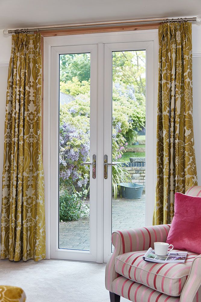
Access to the back yard can completely
transform your home's traffic flow
and make it feel much large.
Aside from the questionable aesthetics of eying the old Kenmore on your way out, having to pass through a secondary room to go outside impedes your use of the garden. Result: A garden that's weed patch city.

Even many glass-flaunting postwar homes have surprisingly bad access to the rear yard. Big windows alone aren’t enough. It’s one thing to look outside; it’s something else again to get there.

Creating better access to the outdoors is one of the most dramatic improvements you can make to your home, not to mention your garden. Happily, it’s also one of the most cost effective: an uncomplicated door installation can usually be done in the range of $5000-$10,000. 

The first step is to choose which room will lead out to your beautiful (well, eventually) garden. In a perfect world, this access would be from the living room or family room; dining rooms are usually too cluttered with furniture to allow good circulation. However, if neither of those rooms face the rear of the house, a door from the kitchen may work just as well. Even a back bedroom will do in a pinch.  They all beat stumbling over old mops and boxes of Tide.

Make sure that the patio or deck outside the doors is
at most a couple inches below the interior floor.
Don't just have a scrap of landing and some steps.
Here are some additional tips on getting into the garden:

•  Make the doors as big as possible. If you’re installing the doorway in place of a narrow window or a blank wall, you’ll need to install a new header above the opening anyway, and you won’t save much by making the opening small. Go ahead—make a grand gesture. The bigger the doorway, the more sense you’ll have of outdoors and indoors flowing together. 

•  Mind your traffic flow. Having easy access to the garden can yield a radical change in the way people use the rooms in your house—a heretofore quiet bedroom may suddenly become Grand Central Station. Make sure that foot traffic to the new doorway won’t be impeded by tables, couches, or sleeping dogs. If you’re using a sliding door, don’t arbitrarily center it in the wall—locate it so the opening panel—not the center of the door—is in the traffic path. 

I'll be over as soon as it's ready.
The same goes for paired doors: despite what you’ve seen in those old MGM musicals, it’s not really possible to burst through both doors at the same time. Crime is up a bit since Sam Goldwyn’s day, so paired doors usually have one leaf (panel) stoutly secured with a cane bolt at the top and bottom. Hence, choose which leaf will be active, and then locate the door so that leaf  is in the traffic flow.

•  Avoid having steps outside the doorway. Even the grandest pair of doors will feel like a back stoop unless the outside paving is nearly flush with the interior floor. If necessary, build a deck to within an inch or two of the interior floor level, so that there’s a generous buffer zone before any steps lead down to the garden.

•  Lastly, throw a big barbecue when you’re all done and invite me over. Salmon’s okay, but steak would be better.

Tuesday, June 26, 2018

GETTING A HANDLE ON LOCKSETS

No "limp fish" handshake here.
(Image courtesy of Old House Journal)
An old teacher of mine always insisted that a firm handshake was critical to making a good impression. “Don’t give ‘em the old limp fish,” he’d warn us. It’s not much of a stretch to say that your home’s locksets (what most people call doorknobs) should show the same fortitude. After all, locksets are the part of your house that everybody shakes hands with.

That’s why even the most frugal developers will usually spring for a top-quality lockset at the front door. They know that it’s the first thing a buyer will touch, and that a favorable first impression here will carry over to the rest of the house.

Given all this, it’s worth choosing your locksets carefully, and not just grabbing an armful of cheapies at the local discount emporium. If your budget can’t handle top-flight locksets throughout the house, then the front entrance lockset is the place to splurge.

Lever handle lock in satin nickel finish.
But can you tell me the finish code?
When choosing a lockset, look for a good solid feel. The motion of the latch mechanism should be smooth and firm, not gritty or tinny. The knob itself should have minimal wobble and should feel heavy, not flimsy and hollow. In general, avoid locksets labeled “builder’s special” or the like; they’re the low-line models. And don’t fall for beefy American-sounding brand names without checking the fine print first: many junky imported brands will try to flim-flam you with a name right out of the Rust Belt.

Here’s a quick rundown of common lockset types:


Standard hardware finish codes, courtesy of Schlage.
•  Entrance locksets usually feature some kind of fixed handle with a thumb latch, and often incorporate a deadbolt as well. Stick to a style that suits your home’s architecture—the model name often gives a good clue—and buy the very best brand you can afford. The front door is no place to cut corners. Besides, with all the wear and tear locksets have to endure, a quality brand is worth the extra investment..

Your basic privacy lock, shown au naturel.
This one is in Finish 612, Satin Bronze.
•  The most common type of in type of interior lockset is the passage lock, which in fact can’t be locked at all. The privacy lock, on the other hand, has a push button, turn button, or lever that allows the door to be locked from one side. A dummy lock is a non-operational doorknob and escutcheon (trim plate) that’s solidly fixed to the door. It’s sometimes used in closets, where a protruding inside doorknob might interfere with stored items.

•  Lever-handle locksets, favored throughout Europe for centuries, found their first widespread use here in disabled-accessible buildings. However, their good looks and practicality—you can still operate them with your hands full—have made them a popular alternative to knob-type locksets. A full range of designs, locking functions, and finishes are available.

A substantial front entrance makes an impression
that carries over throughout the house.
•  Locksets come in a huge range of finishes, but only the most common—bright chrome, satin chrome, polished brass, satin brass, and satin bronze—are readily available at hardware stores. Blackened finishes (commonly known as antiqued) are coated with black paint and then polished, leaving highlights that emphasize their form.

Additional finishes, such as hammered iron, bright bronze, and oil-rubbed bronze, are available at a higher cost. Perishable finishes such as brass and bronze are usually lacquered, which temporarily preserves their just-polished look. Unfortunately, the lacquer eventually wears off in spots, allowing the finish to oxidize in an unattractive mottle fashion. Personally, I prefer to forego lacquering and allow the bare metal to form a permanent oxide coating, which will acquire natural highlights over the years.

Monday, June 18, 2018

A LEXICON OF LUMBER

Studs: They're a lot easier to find when the room looks
like this. Otherwise, buy a good studfinder.
Watch any of those popular home-improvement shows on television, and you’ll ’ll be assaulted by a barrage of arcane carpentry terms. Given that it’s a sort of badge of honor among do-it-yourselfers to know their studs from their stools—as it were—I humbly offer the following primer:

•  Stud. We’ll start with an easy one, what? Anyone who’s ever hung a picture knows that a stud is one of the vertical 2x4s that make up the wall framing. They’re usually spaced 16” apart (or “on center”, as architects and builders like to put it).  However, knowing what a stud is is one thing; finding one is another. A sharp rap on the wall with a knuckle will do for the experienced; for the rest of us, an electronic studfinder is a better choice.

Pressure treated 2x4 lumber as now
used for mudsills in place of redwood.
Some is dark brown; some is greenish;
some has telltale needle marks
like this does.
•  Mudsill. Like many carpentry terms, this one has a quaint Middle Ages ring to it. It refers exclusively to the special piece of 2x4 or 2x6 lumber that’s placed directly on top of the concrete foundation wall—a location highly vulnerable to moisture and insect attack. Prior to World War II, the mudsill was usually made of redwood to resist the effects of termites and rot. Because redwood is so pricey now, it's been replaced by pressure treated lumber. This is just ordinary Douglas Fir with a preservative injected into it, which explains why it has all those needlemarks.

A header beam carries the load of upper floors or roofs
whereever there is an opening in a wall,
such as a door or window.
•  Joist. Now here’s a word with a nice creaky sound that’s perfectly suited to its meaning. A joist is one of the narrow beams that supports your floor. Like studs, joists are spaced 16” on center; they range in size from 2x6 to 2x12, depending on the load they carry and the distance they span. And by the way—it’s usually not the joist that creaks, it’s a piece of the subflooring rubbing against against its neighbor.

•  Header. This is the elusive critter you hunt for when you’re hanging curtain rods. Most people have heard of it, but because it’s hidden by drywall, they’re not quite sure what it looks like or what it’s for. A header is simply a heavy wooden beam—nowadays usually a 4x12—that bridges a door or window opening and carries the load above it. 

The part of the rafter that stick out past the exterior wall
is variously known as a lookout, an outlooker,
or a rafter tail, depending on where
the carpenter comes from.
•  Stool.  Here’s a puzzling one. Stool is the technical term for that piece of wood across the bottom of a window opening—the one any normal person would call a sill. In the building trades, however, sill only applies to the stool’s counterpart on the outside of the wall.  Oh, and that little piece of trim beneath the stool?  Why, that’s the apron, of course.

•  Outlooker, rafter tail, lookout. Carpentry terms vary a lot by region—a fact that’s nowhere as evident as in these terms. All of them refer to the part of the rafter that projects past the outside wall and is visible under the eaves. While they’re all charming terms, “rafter tail” is my favorite, because it jibes delightfully with the carpenter’s name for the wee notch in the rafter where it crosses the outside wall: birdsmouth cut.

•  Ledger. Maybe you’ve already guessed that this term doesn’t relate to bookkeeping—something both contractors nor architects are famously bad at. In carpentry, a ledger is a piece of 2x lumber that’s attached to the face of a wall to support some other structure—the floor of a deck, for example.  I suppose it derives from “ledge”, which is sort of what it creates. So why isn’t it just called a “ledge”? 

Look, I just write about this stuff, I don’t invent it.

Monday, June 11, 2018

WAY BETTER WINDOWS

German windows—the Mercedes Benz of fenestration.
With the handle in one position, the sash tilts in;
in another, it opens like a casement. When closed,
it sealed flat-out airtight.
I never saw a serious window until I visited Germany during the 1980s. It was a revelation to find that German windows were built with the same Teutonic solidity as a Mercedes-Benz. They were massive, with broad, heavy frames of wood or polished aluminum joined with perfectly mitered corners. The lock hardware was both substantial and practical: with the handle in one position, the window tipped inward for ventilation; in another, it opened like a normal normal casement. Most importantly, when locked, the window was sealed virtually airtight against the elements. 

With Germany’s harsh climate and high energy costs, weathertight, energy-efficient windows have always been indispensable. Not so here in the States: as little as thirty years ago, the average tract house window still consisted of flimsy aluminum frames, with a single sheet of 3/16” glass, hit-or-miss gasketing, and rinkydink extruded hardware. These windows were affordable in first cost, but in terms of energy efficiency, they were little better than a hole in the wall. But back then, who cared? America got its energy dirt cheap. From Boise to Buffalo, the remedy for a cold, leaky house was simple—turn up the thermostat. 

By contrast, this is what most American homes had just
thirty years ago: Flimsy, leaky, aluminum dreck.
As energy prices began their inexorable climb, however, people suddenly realized how much of their heating dollar was literally going out the window. At least one progressive state government woke up to this fact as well. In 1978, California, then under the first two terms of Governor Jerry Brown, enacted Title 24, which mandated that new homes maintain a minimum level of energy efficiency. Despite the usual bellyaching over government intrusion into private business, it was the granddaddy of energy-efficiency legislation, and numerous states eventually followed suit. 

Only then did window manufacturers finally recognize the huge market for a window that was both affordable and energy-efficient. Nowadays, the best U.S.-made examples are just about on par with their German cousins, both in energy efficiency and construction quality. Some of the features to look for:

Triple glazing: Overkill for most U.S. climates, but
maybe not so for sound attenuation.
•  Double- and triple-glazing for improved R-values (a measure of an assembly’s resistance to the flow of heat—the higher the number, the less heat is conducted). Many states have made double-glazed windows all but mandatory, since they’re at least twice as efficient at retaining heat. Triple glazing performs even better, although the additional investment is seldom worthwhile in a mild climate. However, because the air captured between multiple panes of glass also serves to reduce noise transmission, you may want to consider using triple-glazed windows in rooms facing traffic noise or other unwanted sound. 

•  Inert gases sealed between the panes of double  and triple glazing. Gases such as argon conduct less heat than ordinary air, thereby improving the insulating value of the window assembly.

•  Vastly improved hardware and gasketing, which provide an airtight seal against infiltration of cold outdoor air, along with thermal breaks to prevent heat from being conduct ed outdoors via the window frame. Aluminum, in particular, is a notoriously efficient thermal conductor, so many window manufacturers now interpose less conductive materials such vinyl or rubber between inner and outer frames to help stem the flow of heat.

Today, American windows are almost on par with
European ones. Almost.
•  Low-e glass, which captures the sun’s warming infrared rays and prevents them from being re-radiated to the outdoors—a sort of one-way valve for heat—and UV-filtering glass that blocks ultraviolet radiation, which helps reduce fading of interior surfaces such as carpets, drapes, and furniture. 

Taken together, these improvements have saved countless millions of barrels of oil and kept who knows how much carbon out of the atmosphere. Granted, they took a generation to enter the mainstream of US building practices, but in the face of today's ever-more alarming changes in climate—well, better late than never.