Tuesday, May 19, 2020

THE LATEST COLOR TREND IS GLOOM AND DOOM

The Craftsman style of the early 20th
century rebelled against both the
ornament and carnival-like colors
of the Victorian era. Cool and crisp
was the watchword.
The other day I was driving down a local street lined with carefully inoffensive white, beige, or gray bungalows, when something remarkable caught my peripheral vision: blazing out from among the dreary shades was an electric blue cottage with lavender trim. While no doubt a few of the neighbors were dismayed by this violation of Waspish color preferences, the effect was both unexpected and charming. 

Colors are a mysterious thing. We all see them a little differently, and when you get right down to it, they exist as much in the mind as in the objects we perceive. Few reasonable people would argue that one color is better than another. Still, there are always folks out there who think they know best which colors are “tasteful” and which aren’t, and are anxious to let people know about it.  

Astonishing, saturated reds, greens,
and browns were a favorite during
the Art Deco period in the 1930s.
This the lobby of the Paramount
Oakland Theater, built in 1932.
In fact, color preferences are an intensely individual choice that varies from person to person and from culture to culture. Consequently, it’s nobody’s business but our own to decide which colors we like best.
A glance at the previous century’s changing color fashions shows both the human craving for variation and the relentlessly cyclical nature of taste, which has swung from reticent colors to vibrant ones and back again.  

In the United States, the opening of the twentieth century gave rise to the Craftsman era, a reaction to the kaleidoscopic palette of Victorian architecture.  Artifice was out, and natural simplicity was in. In keeping with these naturalistic aspirations, pristine whites once again returned to architecture, set off by deep, muted browns, greens, and golds.  

Now that's cheerful! The 1950s were a decade of
unmatched optimism in America's future, a fact
reflected in the ebullient colors of the era.
By the late 1920s, however, the arrival of Art Deco, with its electrifying jags-and-curves motifs, brought with it an equally dramatic shift in color tastes. Art Deco designers daringly allied black with celadon greens, icy blues, and a whole range of red and yellow ochres--a trend that lasted until the eve of World War II.  

The drab, camoflauge-like colors of the early postwar era--gray-greens, gray-blues, or ruddy browns--were surely inspired by the inescapable military imagery of the war years. A rebuke to this trend arrived in the 1950s, when light, airy pastels in pink, blue, yellow and turquoise dominated residential design. This gradual return to strong, clear colors lasted well into the 60s, culminating in the vivid psychedelic palette of the late decade.  

The ecology movement inspired the 'earth tone"
colors typical of the 1970s.
The pendulum of taste began its reversal during the Seventies, when the ecology movement helped foster a trend toward “earth tones”--a muted, naturalistic palette of beiges, tans, and browns. Despite a brief Postmodernist digression into happy neopolitan ice cream shades in the early 80s, the trend away from strong colors continued, culminating in the late-century fixation on whites, grays, and gunmetal blues. 

A taste for poisonous greens, bilious yellows, and muddy browns came to represent the first color trend of the new millenium--no doubt a sort of rebellion against the resolutely bland palette of the 80s and 90s.

And here's where we are now: What does this say
about America's current sense of self?
Alas, things have only gotten gloomier, what with the current fixation on gray, gray gray. It's a sad comment on the zeitgeist, which has been on fairly shaky ground since the Great Recession. Nowadays, in addition to houses, practically everything from cars to clothes to computers are offered in resolutely cheerless tones. A quick glance at any parking lot will tell the story—a car that isn't gray is probably black or white.

Personally, colors of gloom and doom aren’t my cup of tea. But would I dream of telling my neighbors that their newly-painted gray house wasn't “tasteful”--whatever that means?

If the guy in the electric blue house can’t make me do it, neither can they.

Wednesday, May 13, 2020

WHY THE CONCEPT OF "GOOD TASTE" IS A MYTH

Joan Crawford as Mildred Pierce: She had no use for
"gingerbread"—but no need to pull out a weapon over it.
Channel surfing a while back, I happened across an old Joan Crawford movie called Mildred Pierce.  I won’t summarize the plot here—I couldn’t do it in the length of this blog anyway—but suffice it to say there were adequate histrionics to win Crawford an Oscar for best actress in 1945. What really caught my attention, though, was a scene in which her social-climbing character is about to buy a spectacular though long-empty half-timbered mansion.  As she surveys the ornate interior, she sighs resignedly and declares: “It’s not so bad, really...just tear down some of this gingerbread—”.

The French detested the giant wrought-iron radio tower
engineer Gustav Eiffel erected in the middle of Paris
in 1889.  Since then, their opinions have mellowed.
I puzzled over this line for a moment before realizing that, from the vantage point of 1945, the home’s design was supposed to be revolting. 

How far we’ve come—or rather, how far we’ve come around. Like everything else in history, architectural styles are cyclical: every half-century or so, our idea of what constitutes good taste does a flip-flop. In Mildred Pierce’s time,  “gingerbread” was practically an epithet, and people tore it down if they had it. Today, people put up gingerbread if they haven’t got any, and it’s Modernism that’s down for the count.

When Frank Lloyd Wright's Robie House was constructed in
Oak Park, Illinois in 1909, outraged neighbors called
 it a monstrosity.  Chalk up another loss for the concept
of "good taste".
The lesson is that, in architecture as in art, there are no hard and fast rules, no right answers, and ultimately, no such thing as good taste. I’m always amused at the astonished reactions I get when I make this statement. Some people bristle as if they’ve been personally insulted. All of us think we know what good taste is, and—surprise surprise—it’s usually pretty close to our own. But like beauty, good taste is in the eye of the beholder. What passes for exquisite refinement in Milwaukee would draw yawns in Mumbai or Manila. Moreover, there’s no reason to assume that our own ideas of good taste are any more valid than those of other cultures—they’re just more familiar, that’s all.  

This is a standard color scheme in a
popular housing development known as Jubilation Enclave,
 just south of Manila in the Philippines.
What’s more, even within a particular culture, good taste is a prisoner of its own time. In 1889, a Swiss engineer constructed an enormous, riveted wrought-iron tower to serve as the centerpiece of the Paris Exhibition. The French considered it an abomination and demanded its prompt demolition after the fair closed. Rather than being destroyed, of course, the Eiffel Tower eventually became the very symbol of Paris.  

Likewise, at the dawn of the twentieth century, residents of the tony Chicago suburb of Oak Park were repeatedly outraged by the construction of a series of new homes which most of them considered monstrous. They were referring to Frank Lloyd Wright’s epoch-making Prairie houses. 

Chart of approved "color options"  allowed
by the Homeowner's Association of the
San Ignacio Golf Estates, Green Valley,
Arizona. Evidently, they are not fond of blue.
Some might argue that, apart from the temporal biases most of us are constrained by, there are still some absolutes of good taste that remain valid in any era or setting—rules based on classical proportions, color theory, respect for context, and the like.  But even this notion doesn’t hold water. Over the centuries, dozens of architects have changed the course of design history by flouting accepted “rules” of good taste, not the least of them Michaelangelo, Bernini, Richardson, Wright, and Venturi.

All this leads to a rather unsettling question. If there are no absolutes of taste—or, to put it more precisely, if our ideas of good taste are always prisoners of our own zeitgeist—how do we decide what our buildings should look like?  

Why, we rely on the infallible judgement of our local design review board, of course.

Just kidding. 

Tuesday, May 5, 2020

ARCHITECTURE'S MOMENTS FROZEN IN TIME

A moment literally frozen in time: This brick in the wall
of my office was bumped out of place by the mason.
Note the frozen ribbon of mortar trailing below.
Halfway up one of the brick walls of my office, part of an old factory building dating from 1907, there’s a single brick that’s twisted slightly out of position. Beneath it, a solidified ribbon of mortar hangs frozen in a drooping arc, attesting to the fact that the brick was bumped within a few minutes of the time it was placed, while the mortar was still wet.  

All told, there are about six thousand exposed bricks in the walls of my office and some half-million in the building altogether, most of them laid with ordinary accuracy.  That single brick, however, stands out both literally and figuratively.  

The hammer blows of the blacksmith are always evident
on hand-crafted materials such as this wrought-iron railing.
Why?  Because it gives an almost eerily direct temporal connection to the moment in 1907 when a mason, now long dead, placed--and then accidentally displaced--that single brick.  Perhaps he nudged it with his foot as he moved along the scaffold;  perhaps he had a few nips of whiskey with his lunch;  or perhaps it was just close to quitting time, and he was tired.  The possibilities are as vast as the likelihood of ever really knowing is small.  The brick can’t tell the story; it can only record the outcome of that moment over a century ago.

It may seem odd that imperfections are often the very things we find intriguing in our surroundings, but so it is. Imperfections, which are the inevitable traces of human effort, are what put a premium on handcrafted objects over machine-made ones. They tell us that someone--perhaps someone much like us--put heart and soul into making them.  

In a counter reaction to the Industrial Revolution,
so-called Arts and Crafts furniture celebrated
the "imperfections" of hand craftsmanship.
For this reason, architects have long admired brick, stone, carved wood, wrought iron, and other building materials that provide an obvious record of human effort.  If flaws seem like a strange thing to admire, the alternative is much worse. Pursuing visual perfection, as some architects are wont to do, is a sure ticket to failure. This is the inevitable flaw in the sort of frigid Minimalist work that appears ad nauseum in chic design magazines.  While such projects always look smashing in glossy photo spreads, the real test comes later, when time has inevitably begun to affect those “perfect” details and they start showing wear or simply fall to pieces.

For a time following the Industrial Revolution, machine-made objects were regarded as superior to handmade ones. Yet eventually, social critics such as England’s John Ruskin managed to reawaken the public to the beauty of items fashioned by hand, whose innate sense of life no machine could ever match. 

To cut or carve or build is to express one's self:
Normandy Village,  Berkeley, California,
designed by architect William R. Yelland in 1926.
(Photo by my friend Douglas "Sharp As A Tack" Keister)
The resulting counter reaction ushered in the Arts and Crafts movement in England, as well as its American counterpart, the Craftsman style. Craftsman architecture showcased coarse materials such as rough stone, clinker brick, and carved wood that were pointedly worked by hand, directly refuting the Victorian machine aesthetic. Later on in the early 20th century, Spanish, Tudor, and other period revival styles provided an even bigger canvas for hand craftsmanship.

“Every time a man puts his hand down to cut or carve or chisel or build a house,” wrote the architect William R. Yelland during the period revival era, “he must express his own self.”  It is this self-expression, a record of human passing forever condensed out of evanescent time, that is architecture’s greatest gift.  

Tuesday, April 28, 2020

AFFORDABLE HOUSING: The Invisible Answer, Part III

Is this your mental image of a manufactured home?
Believe it or not, prior to the late 1930s, people who lived in travel trailers full-time were hailed as adventurous, modern-day nomads, and were widely admired by the public. By the tail end of the Depression, however, vast numbers of impoverished families had resorted to living in broken-down homemade trailers, and the public perception of trailer dwellers completely reversed. Cities and towns passed laws barring them from entering city limits, or else imposed heavy fees to discourage them from staying overnight.  

 As late as the 1950s, trailer manufacturers
were still pretending their products were
"mobile"—though smart buyers already
just considered them affordable housing.
Today, this sad legacy persists in the unkind treatment of mobile home dwellers as second-class citizens—people whom zoning laws still relegate to living beside tank farms or beneath runway approaches. Little wonder that even the most mortgage-enslaved Americans still recoil at the thought of dwelling in such places. 

Yet if and when America ever develops a true mass-produced form of housing—one that does for the cost of homes what the Model T did for the cost of cars—it will most likely be an outgrowth of the mobile home. For decades, and without the fanfare accompanying the many “affordable” housing solutions proposed by architects and visionaries, mobile homes (or, as the industry now prefers to call them, “manufactured homes”) have been providing decent, mass-produced lodging for a fraction of the cost of site-built houses.  

It's already been a hundred years since Henry Ford
perfected mass production techniques. Builders of
traditional housing never got the message—
but trailer builders did.
The main reason for this difference is simple. While conventional homes use a few factory-built components such as roof trusses, doors, windows, and cabinets, the lion’s share of the structure remains entirely hand-built. By contrast, the manufactured home industry literally grew up with mass production, thanks to its prewar origins in building travel trailers. From a modest start—few early trailers exceeded 160 square feet or so—the industry inexorably progressed to larger and more sophisticated units. By the late Sixties, huge, factory-built “doublewides” routinely enclosed areas of around a thousand square feet, which is about the size of an average bungalow home of the 1920s. Along the way, manufactured home builders quietly acquired the sort of mass production techniques that the site-built housing industry still considers revolutionary.

Is it site built or is it manufactured? Go ask Brigadier
Manufactured Homes of Waco, Texas.
(Hint: Image courtesy of Brigadier Manufactured Homes) 
Why all  the fuss about mass production? What’s wrong with the way we build traditional houses? The answer is that, of America’s innumerable consumer products, homes are among the last that are predominantly handmade. This implies the same thing for houses that it does for any other handmade product: high cost. It’s one of several admittedly complex reasons that fewer and fewer middle-class Americans—let alone the poor—can achieve the dream of home ownership these days.  

Still, even in the wake of the thrashing we got from the Great Recession, many Americans still believe that a “real” house, whether affordable or otherwise, should be built onsite and not in a factory—a perception heartily supported by the building industry, whose livelihood depends on houses continuing to be built largely by hand. Hence, it’s doubtful that manufactured homes will be accepted by mainstream home buyers until they can unflinchingly compete with site-built homes in appearance, construction quality, amenities, and safety.  

Living room of a manufactured home. The industry has worked
long and hard to overcome the longstanding bias against
 "mobile homes" and their occupants.
(Image courtesy of Jacobsen Homes)
For many years, the manufactured home industry wasn't quite up to this challenge, and remained satisfied with sometimes-haphazard planning and a dubious, two-dimensional aesthetic. Yet that is changing. And in light of America's desperate need for housing that's affordable in fact and not just in name, this venerable industry—which has already ridden out wildly changing fortunes, regulatory discrimination, and decades of public ridicule—can surely still be counted on to provide a few surprises.

Tuesday, April 21, 2020

AFFORDABLE HOUSING: The Invisible Answer, Part II

Arthur Sherman's "Covered Wagon"
trailers featured solid walls instead of
canvas flaps—a modest start to today's
manufactured housing industry.
Author's note: This is Part II of a three-part series on an affordable housing solution that's been right in front of us for almost a century.

Architects love to start from a clean slate.  It’s inherent in our training, and often, it’s for the best—after all, clean-slate thinking has given us Falling Water, Ronchamps, and countless other architectural triumphs. 

Yet sometimes, incremental improvements on a humble concept are more useful than the grandest plans made from scratch. This is the case with affordable housing. Consider what architects have actually done to make homes more affordable during the past eighty years—in practical terms, next to nothing—and compare this with the erstwhile trailer industry, that paragon of gauche design, which has stumbled along unceremoniously only to arrive at affordable housing that really works.   

Buckminster Fuller's original Dymaxion House of 1933,
now in the Henry Ford Musuem at Dearborn, Michigan.
Fuller's idea was to apply mass production techniques
to housing—a goal that proved elusive.
The trailer story begins in the late Teens, when Americans first piled into their flivvers to go “autocamping” along the nation’s scenic new roads. At first, campers simply carried tents, but by the early Twenties, many were towing tiny trailers that cleverly unfolded into roomy canvas cabins. Meanwhile, towns throughout the country opened auto camps—later known as trailer parks—to attract tourist dollars.  

In 1929, a Michigan man named Arthur Sherman got tired of wrestling with his tent trailer and built himself a solid-walled masonite version that didn’t need setting up. The idea caught on, and Sherman wound up in the trailer business, with hundreds of others soon following. By the mid-Thirties, trailering and trailer parks were such a huge phenomenon that one expert foresaw half of all Americans living in trailers by 1955.  

By the time this ad ran in the March 9, 1946
 issue of Saturday Evening Post, trailers
were already providing the practical
equivalent of Fuller's mass-production idea.
Yet trailer dwellers were seen as distinctly
lower class—a perception that lingers today.. 
Yet by 1937 the trailer boom had collapsed, the victim of a saturated market and its own overheated rhetoric. Meanwhile, broken-down trailers became the only homes many Depression-bound Americans could afford, changing the public’s original perception of trailer dwellers as wholesome, fun-living nomads to the more familiar stereotype presuming shiftlessness and poverty.  

World War II  briefly redeemed the trailer’s image. Faced with an urgent need to house defense workers, the government ordered some one hundred thousand trailers during the course of the war, and in the process helped demonstrate the lowly trailer’s value as a year-round dwelling.

The postwar housing shortage brought many novel ideas for affordable, mass-produced housing, from the all-steel Lustron home to Buckminster Fuller’s aircraft-based Wichita House. Once again, however, the clean-slate approach created spiraling costs that preempted any chance of affordability.

By the 1950s, travel trailers were getting bigger and bigger;
eventually, the industry was forced to acknowledge that
they were really building homes, not recreational vehicles.
The trailer industry, on the other hand, simply picked up where it left off, adding homey touches and increasing size, until by the early 1950s some models were over 25 feet long. These units were now clearly designed for year-round living, though in light of the trailer dweller’s shady reputation, the industry remained loathe to concede this.  

Only in 1954, when a Wisconsin firm introduced a trailer so large it required a special permit to transport, did the industry finally begin to acknowledge that year-round trailer dwellers were its real market. Twelve-foot-wide, fourteen-foot-wide, and double-twelve-foot wide trailers eventually followed, at prices that nevertheless were a fraction of conventional site-built homes.

Is it a house or a mobile home? Whatever you call it,
it costs up to 40% less than a site-built house.
Yet even so,  "manufactured homes" remain
the unloved stepchild of the housing market, due in large
part to discriminatory zoning laws that still frown on them.
Today, the travel trailer’s descendants—now known as manufactured homes—have quietly fulfilled the whole gamut of affordable housing requirements, and have done so through evolution and not revolution. They are mass-produced and hence affordable; they can be easily customized and rapidly deployed, and they provide the familiar domestic imagery so many homeowners take comfort in.

Yet despite these attributes, manufactured homes remain largely invisible to the architectural profession. Hence, the question is not whether such homes can provide an affordable housing solution—they already have, and for decades.  The real question is why architects, and much of the public, still seem to wish they hadn’t.  

Next time: If manufactured homes are so great, what's holding them back?

Tuesday, April 14, 2020

AFFORDABLE HOUSING: The Invisible Answer Part I

Is this any way to house people
 in the richest nation on earth?
(Image: Mark Brown/Chicago Sun-Times)
Rising homelessness and the lack of affordable housing have reached crisis proportions during the last few years, and the current Coronavirus crisis has only made the problem more acute. 

A while back, I wrote a column on why architects have so often failed at designing affordable housing. It drew a flurry of responses from my colleagues—some thoughtful, some merely huffy and self-righteous. A few architects who’ve spent a good portion of their careers developing affordable housing were understandably offended at being lumped in with the rest of us. Many others missed the point altogether, which was that traditional architectural schooling all but guarantees an architect who’ll design expensive buildings, not affordable ones.
"Affordable Housing": In Oakland, California,
4000 people applied for these 28 units.

Many respondents cited examples of successful, high-profile affordable housing projects aimed at low income groups. Few acknowledged that the need for affordable housing is no longer limited to the poor--increasingly, it applies to the middle class as well. Over the past twenty years, aspiring middle-class home owners have been relentlessly hammered—early in the century by the ballooning cost of single family homes, then by the Great Recession, and now by the likely economic debacle brought on by the Coronavirus. 
Flow chart of the steps required to obtain
design review approval in a city to remain unnamed.
No, not a building permit—just approval of
how your building is going to look.

In fact, through feast and famine, the median price of homes has continued to rise ahead of any increase in family earnings, despite the increasing reliance today’s families place on dual incomes. Simple arithmetic will reveal the result: More people than ever are now deprived of the American dream of home ownership.  

How can any nation expect to provide affordable housing for its poor when, increasingly, it can’t even house its middle class? And can any place really be called a “community” when its own teachers, firefighters, cops, and librarians can’t afford to live there?  

The reasons behind the rising cost of homes are manifold, as many correspondents pointed out. By heavily favoring loans for conventional housing types, conservative lending institutions help enforce formulaic, cookie-cutter development, while quashing promising housing ideas that fall outside the usual bounds.  
Typical municipal zoning map.
(This is for Barnesville, Georgia, population 6,711).
Barnesville ain't Chicago, but it's probably
just as tough to build something there.


Our nation’s moribund zoning laws have had a similar effect, though they do it by segregating usages and doggedly insisting on low densities and land-squandering building setbacks. Developers--the few that still dare to build in this  economic climate--respond to these limitations by sticking to well-tried formulas, concentrating on the sort of huge, overblown tract homes that used to yield the highest profits.  

Architects have bills to pay too, and perhaps that’s why so many of us in the profession seem unwilling to raise our voices against the idiocies of hyper-restrictive zoning, meddlesome design review boards, and the national appetite for pointlessly oversized home designs.       
An old manufactured home—better known as a trailer.
Don't laugh: It works, and it's affordable.
Strangely, though, despite the many architects who voiced an opinion on the subject of affordable housing, not one cited the most successful and ubiquitous form of affordable housing there is--possibly because architects have had virtually nothing to do with its development. 

I’m talking, of course, about manufactured homes, those boxy, prefabricated units that used to be known as mobile homes and, before that, as trailers.  Despite garnering little more than contempt from the architectural profession during their fifty-plus years of existence, manufactured homes are among the few housing types that actually deliver on the promise of affordability, every day, and in every state of the union.  

Scourge or solution?  We’ll take a closer look next time around.

Tuesday, April 7, 2020

THE "CALIFORNIA" FINGER PLAN SCHOOL: Incubator for the Baby Boom

Burton Elementary School, San Fernando, California (1951).
With its long rows of classrooms and covered outdoor
corridors, it's practically a dead ringer for my grade school,
Crawford Village, and hundreds of other postwar schools.
Author's note: The closure of many public schools due to the Coronavirus—and the abrupt plunge into online learning this has brought about—portends a great change in our thinking about how and where learning needs to take place. What follows is the story of an earlier learning revolution which many of us unknowingly took part in long ago.

Change the name, and any Baby Boomer would recognize my old grade school, Crawford Village Elementary. It was one of those flat-roofed, single-story jobs with parallel rows of classroom wings, all linked together by covered outdoor halls edged with pipe columns. At the main entrance was a barren, concrete-paved quadrangle with a flagpole; beyond was an auditorium known--as it was in all such schools--as the Multi-Purpose Room. Inside it were ranks of long lunch tables that folded neatly into the walls, a wardrobe filled with Traffic Patrol uniforms, and an elevated stage. In this vast, asphalt-tiled room, redolent with the smell of countless cafeteria lunches, we were gathered to watch the Bell Labs epic “Our Mr. Sun” at least once a year.   

Architect Ernest J. Kump,
father of the "California"
or finger-plan school,
which revolutionized
school design.
Thousands of schools just like Crawford Village were built across America from the late Forties through the mid-Sixties to handle the postwar baby boom. Known as “finger plan” schools because of their parallel rows of classrooms, their design was pioneered by the noted architect Ernest Kump (1912-1999). Kump’s first finger plan design, Acalanes High School in Lafayette, California, was enormously influential, and served as a prototype for public schools of all levels well into the Sixties.  
Daydreaming students were sure to
have noticed these iconic lamps,
which provide shadow-free light
for reading, writing, and 'rithmetic.

Kump’s basic finger plan scheme could be easily adjusted to a variety of sites--a fact that delighted architects scrambling to keep up with the era’s boom in school-building. As it happened, I eventually served my internship with Reynolds & Chamberlain, one of the four associated firms that designed Crawford Village and dozens of California schools like it during the 1950s. One of the principals used to joke that when he received another school commission, he’d simply take out the same old drawings and change the name of the school on the title sheet.  Although it wasn’t quite that simple, there was more than a passing resemblance among these designs.

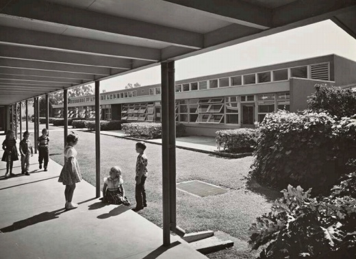
In finger plan schools, classroom windows invariably faced
 north to provide diffuse daylighting, but also featured
a south-facing clearstory for natural ventilation.
This is Thomas Jefferson School in Anaheim, California,
c. 1954, by Smith, Powell and Morgridge, Architects.
(Image: Getty Research Institute, Schulman Archive)

Typical of finger plan schools, the classrooms at Crawford Village had a whole wall of windows facing north and a high clearstory that peeked over the hallway roof on the south. The entirety of the room’s artificial light came from six curious ceiling lamps with Saturn-like rings surrounding a silvered bulb. The ceilings and the upper part of the walls were covered in perforated acoustical tile whose holes made a challenging target for pencil-stub projectiles.  

Only in retrospect have I come to appreciate the ingenuity of these schools, whose ubiquitous traits grew out of the need to accommodate a rising flood of school kids as quickly and efficiently as possible. The buildings were built on inexpensive concrete slab foundations, with wood-framed walls rendered in stucco; their outdoor corridors obviated walls altogether. The width of those long, narrow “fingers” of classrooms was quite simply determined by the distance a 2x12 roof joist could span.  

The clock ticks past 3:00 at Orville Wright Middle School
in Los Angeles (Architect: Spaulding & Rex, 1948)
Time eventually ran out for the finger plan school as well—
although many of its features have stayed with us to this day.
Hot water pipes for radiant heating were embedded in the floor slabs, avoiding attics full of ductwork, while still keeping students toasty in winter. The tall walls of north-facing glass gave diffuse daylighting, while those peculiar lamps served to bounce light onto the ceiling, from whence it was evenly reflected to the desktops.  
Today, with the Baby Boom just a fading playground echo, large numbers of the old finger plan schools have been closed, demolished, or converted to other uses. In a sign of the times, Crawford Village Elementary has become a retraining school for adults.  Although the paint scheme has changed and the classrooms are now jammed with computers, somehow I suspect these new students still feel right at home, waiting for that clock up in the corner to tick oh-so-loudly to the school day’s end.