Monday, July 31, 2017

BATHROOM DESIGN: There's Still Room For Improvement

Here's the origin of the term "water closet"—Victorians
were terrified of being asphyxiated by sewer gas.
This ad for the British fixture manufacturer
Thomas Crapper and Sons also demonstrates
the origin of the word "crap".
If you think Frank Lloyd Wright was a genius, take a look at one of his bathrooms. Wright, like most nineteenth century architects, couldn’t design a john to save his life—but back then, nobody cared. People were happy just to have indoor plumbing.  

The bathroom as we know it (that is, a lavatory, toilet, and tub contained in one space) is an American invention. Such rooms appeared in plan books as early as the 1850s, although they took a few decades to really catch on. Early bathrooms usually had a lavatory sink and a freestanding tub rather haphazardly placed in a good-sized room. However, the toilet was banished to a separate cubicle—hence the term “water closet”—due to a pervasive Victorian dread of sewer gas wafting out of the bowl and killing people. 

After reliable drainage traps finally alleviated these fears, the separate cubicle was eliminated, and the toilet was given an equally haphazard position inside the main bathroom space.
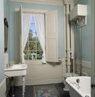
A fixture here, a fixture there...early bathrooms
were not too well organized.

Cleaning was a headache in these old bathrooms, with their high, wall-mounted toilet tanks and tangles of exposed plumbing. Things didn’t really improve until the introduction of close-coupled toilet/tank combinations and built-in tubs, which did away with a lot of inaccessible crevices.  The latter also gave rise to that mainstay of American tract houses—the five-by-eight-foot bath, with its tub placed crosswise against the far wall.

Bathroom planning finally left the dark ages during the 1960s, when architects began to think of aesthetics as well as function. The “do-your-own-thing” mindset of the time brought us the sunken tub, an early harbinger of the outrageous bathrooms we commonly see today.  While some of the design excesses since that time have verged on absurdity, at least the standards have been raised. 

One thing about bathrooms hasn’t changed, though: Everyone still hates cleaning them. Moreover, a lot of people make matters worse by choosing arrangements that are a real pain to live with. Whether your bathroom is big or small, here are some practical design considerations that shouldn’t be ignored:
A lavatory no-no—don't place the cabinet
right next to the tub wall, or you'll grow
all kinds of nasty stuff there.

•  If you have romantic notions about installing a clawfoot tub in a small bathroom, forget it.  There’s a good reason these tubs fell out of use: With their exposed piping and hard-to-reach surfaces, they’re a cleaning nightmare. Unless you have room to burn and you can get at all four sides of the tub, your bathroom will be Mildew Central in no time.

•  If you’re using a lavatory cabinet, don’t install it directly adjoining the tub. Not only does it look clumsy, but the resulting crevice traps water and crud, creating the same kind of nasty problems outlined above. The usual fixture sequence of lavatory/toilet/tub is common for a good reason—it works.    
As for as I'm concerned,
this faddish sink is not even in the running.

•  Unless you like to spend all day wiping things down, avoid top-mounted lavatory bowls, whose raised rims make it maddeningly difficult to keep countertops clean and dry. Integral bowls—the kind that are monolithic with the countertop—are the hands-down winners for ease of cleaning. Undermount bowls run a close second. That ridiculous fad known as the "vessel sink", which sits entirely on top of the counter, should not even be in the running.

•  Even if you’ll have an openable window in the bath, include an exhaust fan. The added air movement helps prevent a lot of weird things growing on the walls, so it’s a boon for people who take long steamy showers. Oh, and don’t get one of those anemic sixty-dollar fans either. Look for one with an airflow rating of at least 80 CFM and the lowest noise rating you can afford. Larger bathrooms will require proportionately higher CFM ratings.

Monday, July 24, 2017

DESIGN REVIEW: A Jab In The Eye of the Beholder

How would you like a committee deciding what clothes you could wear each day?

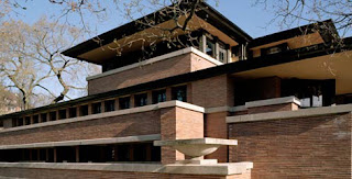
Frank Lloyd Wright's famed Robie House of 1909:
If design review boards had existed at the time,
it would never have been built.
One member might say,  “Sorry—those pants don’t match the surroundings. We think you should try another pair.” Another would add,  “We don’t care for that jacket. It attracts too much attention.”
A third would pipe in with,  “We’d prefer to see a blue shirt, okay?”

There’s a similar institution in many of our city planning departments. It’s called a design review board, and it presumes to tell architects and homeowners what “clothes” their homes are allowed to wear. In many cities, design review is required whenever a set of residential plans is submitted for approval.

Harry Oliver's Spadena House, Beverly Hills (1926):
Would it pass the Design Review Board
in your town? Not bloody likely.
Over the past thirty years, the design review process has exerted an ever-expanding influence on architects and homeowners. But in all that time, no one has really been able to demonstrate its value in making our surroundings more “beautiful”—whatever that really means.

Design review is based on the shaky premise that a panel of city appointees can judge aesthetics better than anyone else, and should therefore have the final say on what your project should look like—more of a say, even, than you or your architect.

Beauty is a highly individual perception, however. What’s more, our judgment of aesthetics is inextricably rooted in the context of our own time. Architecture that we find ugly or shocking today may well be perfectly acceptable in twenty years. Conversely, the features design review boards love to see nowadays may be considered schlock in a few decades. You se always on shaky ground simply can’t presume to make airtight aesthetic judgments from the vantage point of the present.

Bruce Goff's Bavinger House (Norman, Oklanhoma,
1955—now destroyed): Another non-starter
if Design Review Boards had had anything to do with it.
If design review boards had existed during the time of Frank Lloyd Wright, for example, his most brilliant works would undoubtedly have been muddled beyond recognition, if they were allowed to be built at all. Why? Because Wright’s designs were considered shocking and even ugly in the context of their time, and were generally disliked by the status quo. The same holds true for any number of our country’s most brilliant architects.

And as you might guess, design review boards are composed of ordinary humans with ordinary aesthetic prejudices. That’s why it’s so dangerous for them to decide what is “appropriate” design and what isn't.

Frank Gehry's Venice, CA Beach House (1984):
A Design Review Board might have
approved this design—but only if Gehry
had already been world famous.
Moreover, design review is an infringement on a highly personal freedom: one’s individual sense of aesthetics. You may want to wear a purple shirt—or you may want to live in a purple house. Why should the city government intrude in either of these highly personal choices?

Right about here, I usually get this rejoinder:  “So you’d let people build any old piece of junk, anywhere they want?”

Hardly. For well over a hundred years, cities have had a means of enforcing regulations affecting public health and safety, and rightly so. That instrument is the zoning code, and it’s the proper place for the city to wield its authority. It’s the zoning code, for example, that prevents your neighbor from building right up to your fence line, or locating a gunpowder factory next to your house. No one argues with the need to regulate matters of public safety.

But enforcing public safety is a very different thing from enforcing taste. A purple house doesn’t present any risk to the public.  Or does it, design review officials?  Responses are invited.


Monday, July 17, 2017

IN ARCHITECTURE, IT'S NOT ALWAYS ABOUT SIZE

This 18th century Colonial interior, with its low ceiling
and close spaces, has the sort of scale most of us
would refer to as "quaint".
If you’ve ever tried one of those huge, flavorless things growers call tomatoes these days, you’ll know that size alone is no guarantee of taste. There’s a corollary in architecture: just as monstrous girth doesn’t make a tomato worth eating, size alone doesn’t make a house worth living in.

This point was really driven home to me a while back, when I toured a house whose owner reminded me several times of its vast floor area—nearly four thousand square feet. What seemed more amazing to me was that, for all its size, the house was also utterly charmless. The rooms were huge, bland expanses in which the furniture looked lost. I seemed to walk for yards past blank stretches of spray-textured drywall intermittently pierced  by enormous yet flimsy-looking aluminum windows. There was hardly a nod anywhere to the modest size of an ordinary human being.

The interior of Reims Cathedral (c. 1211-1275): Here,
scale has an entirely opposite effect, but for good reason. 
Which brings me to a crucial property of architecture:  scale. Strictly speaking, scale is defined as the size of building elements relative to the human body (as distinct from proportion, which deals with the size of building elements relative to each other).

Scale determines how you, as a human being, relate to a building. When you walk into a tiny Provincial cottage, for example, it’s your own relatively large physical size that makes the surroundings feel so quaint and charming. On the other hand, when you walk into the soaring nave of a Gothic cathedral, its scale intentionally makes you feel small and humble—after all, it's God's house that you're visiting.

But what’s right for God’s house isn’t always right for yours. Inasmuch as bigger isn’t necessarily better, here are a few suggestions regarding the use of scale in design:

Is this a living room, or a lounge at La Guardia?
•  Don’t make rooms huge for their own sake. Occasionally, I’ll get a client who’ll insist, “I want a huge living room, say twenty by thirty-two feet.”  For him (or her), design is a numbers game meant solely to outscore the neighbors. But it’s a pointless competition: more often than not, such huge rooms have all the charm of an airport lounge, and in any case, the wasted ego-trip space would be better applied to an area where it’s more useful.

If you love large rooms, use smaller
sub-elements to break up the vastness
of the space and give it a more
human scale.
•  Be wary of any single room whose size demands multiple furniture groupings. Such arrangements necessarily split occupants into camps of “us” and “them”, which makes for distant and uncomfortable socializing. Take a lesson from that old saw about party guests always ending up in the kitchen—people naturally gravitate toward intimate spaces, not grandiose ones.

•  Try to get a sense of appropriate room sizes by looking at actual buildings, not simply by studying floor plans or, worse, by guessing.  I once had a client who insisted that his dining area be sunken eight feet below the living room. When I pointed out that eight feet was an entire story, he was horrified.  “I didn’t know it was that much,” he said.  “I just wanted to see out over the dining table.”
Lesson:  Make sure you’re familiar with the dimensions you’re planning on before you commit yourself.

•  Finally, if you simply must have that giant room (or a giant house, for that matter), try to make the rooms more people-friendly by including some small-scale elements such as alcoves and bays to break up the unrelenting volume. But as the lawyers would say—NOT TO BE TAKEN AS AN ENDORSEMENT OF HUGE ROOMS.

Monday, July 10, 2017

DESIGN ALL OUT OF PROPORTION

The Parthenon's design is based on the Golden Rectangle,
with a ratio of approximately 1:1.618. By removing
a square from this shape, another golden rectangle
is created...and so on.
Proportion is one of those fuzzy architectural issues. Webster defines it as “the relation of one part to another or to the whole with respect to magnitude, quantity, or degree”. Yet no one can say exactly what constitutes good proportion.  

The math-crazed Greeks thought they had proportion all figured out.  They devised a series of geometric ratios—1:2, 2:3, 3:5 and so on—that formed the proportional basis for architectural masterpieces such as the Parthenon. Later on, much of the architecture of the Renaissance was based on such ratios as well.  


The strangely gawky vestibule of Michelangelo's
Laurentian Library, with its unsettlingly busy
ornament, leads the viewer into...
But as always, other folks came along to prove that such rules were made to be broken. The sixteenth-century architects known as Mannerists delighted in tweaking Renaissance rules of good proportion by deliberately distorting the forms of their buildings. In Michelangelo’s Laurentian Library, for example, a strangely gawky foyer leads up into a surreally long and low reading room. By juxtaposing unconventional proportions, Michelangelo introduced a sense of visual tension that broke new ground for future architects.       


...the remarkably calm proportions of
the library's reading room—
an unforgettable juxtaposition.
In his seminal 1856 book The Grammar of Ornament, the architect Owen Jones returned to the Greek notion of mathematical ratios, stating that  “. . .in every perfect work of Architecture a true proportion will be found to reign between all the members which compose it. . .the whole and each particular member should be a multiple of some simple unit.” 

Intriguingly, however, Jones added:  “Those proportions will be the most beautiful which it will be most difficult for the eye to detect. Thus the proportion of a double square, or 4 to 8, will be less beautiful than the more subtle ratio of 5 to 8." Here, he almost seems to imply that the least identifiable proportional scheme is best of all—in other words, whatever looks right, looks right.  


Frank Lloyd Wright's long, low Robie House of 1909.
Imagine how this design looked to people who were
used to seeing...
Although the ideals of good proportion are subjective, most people nevertheless judge a design based on its resemblance to architecture they’re already familiar with. Hence the big uproar over Frank Lloyd Wright’s long, low Prairie Houses of the early twentieth century: at the time, Wright’s impossibly low-slung architecture just didn’t “look right” to people accustomed to the spiky verticality of Victorian homes.   

To find out what looks right to you, try sketching your designs without allowing yourself the use of grids, scales or other constraints. Just draw freehand on a plain sheet of paper. You’ll find that when the mind is unfettered by a lot of rules and constraints, it falls back on its own innate sense of proportion.  

...houses with proportions like this one.
I always retain my very first rough sketches of a project for this reason.  Almost inevitably, after doing umpteen variations on the original theme, I end up going back to the proportions of the first sketch because they’re the most pleasing.

Moreover, in some cases, your proportion homework is already done for you: If you’re designing an addition, for example, just take your proportional cues from the original building.  If the windows are tall and narrow in the existing part, for example, use ones with similar proportions in the new work. It’s an excellent way to help unify the design.


Lastly, it’s good to be conscious of the classical rules of proportion, but don’t let them straitjacket you. If ratios or modules are helpful, by all means use them—but remember that beauty is in the eye of the beholder.

Monday, July 3, 2017

As an architect, I usually get a front-row seat at arguments between couples who can’t agree on
design issues. You wouldn’t believe how testy some otherwise googoo-eyed partners can become under the pressure of making aesthetic decisions.  There are times I’d give anything to have Scotty beam me out of there.

Relationships are supposed to be more enlightened these days, what with the myriad forms of head-shrinking now available. Despite it all, many couples are still dreadful at communicating their design opinions tactfully.
"Your idea is a real riot, Alice!"
(Jackie Gleason and Audrey Meadows in
The Honeymooners)

I once sat through a meeting between two married couples collaborating on the design of a shared vacation house. Very early on, one of the wives enthusiastically outlined her idea for some sort of covered veranda. When she cheerfully looked to the others for feedback, there was a respectful silence.  Finally, the husband of the other woman replied:

“I think that would look really stupid.”

Net points for tact:  Zero.

One thing architects learn early on is never to cast their client’s ideas in a negative light, however dubious they may be.  It’s a wise approach for couples, too. Here are some tips to help stave off design-talk debacles:

Your project  won't get far at
this volume level.
•  No matter how crazy your partner’s idea seems, don’t dismiss it out of hand. Perhaps you just didn’t understand it correctly. Ask for a clarification.  Plenty of great ideas sound crazy on first listening. And even if the idea really is as bad as you feared, avoid responding with “You’re a hamster-brained aesthetic moron,” or its equivalent. Instead, try presenting an alternate idea:

“We could try that. Or—how about if we did something like this . . .”  Very often, the original idea is mercifully forgotten when a new and more promising choice presents itself.

•  If you and your partner can’t seem to agree on a particular design issue, try to find the root of the disagreement. Is it the idea’s functionality? Its aesthetics? Its cost? It’s much easier to seek a compromise solution when you know exactly what your partner’s objection is. If this approach doesn’t solve the problem, temporarily set aside the area of contention and move on. If the disagreement is so fundamental that it precludes further discussion, take a few days to cool off and reflect on the best course. A little introspection can work wonders here.

Sorry—not the architect's job.
•  If you’re working with an architect or designer, don’t expect him or her to mediate disagreements you have with your partner. That, I’m happy to say, is still your problem. You and your partner need to be in general agreement on the project’s scope before the architect can do any useful design work.  
However, if a technical ruling by your architect can decide the issue—“I’m afraid that, despite what you’ve seen in Snob Digest, you can’t have a staircase with no railing,”—then by all means solicit his expertise.

•  Finally, a warning:  Few things can nuke a relationship as quickly as a remodeling project. Be prepared for disagreements—in fact, expect them. Allow plenty of room for discussion, and remember that open-minded, freewheeling design debates can frequently yield the most splendid results.